My verdict on Chinese calligraphy: do not begin by asking whether the characters look beautiful. Follow one line and ask what the hand did. A brush pauses, presses, turns and lifts; the ink keeps the timing after the writer has gone. Calligraphy becomes alive when language, movement and consequence are read together.
What is Chinese calligraphy?
Chinese calligraphy is the art and disciplined practice of writing Chinese characters through expressive line. It joins language with movement: every stroke must communicate a character while carrying pressure, pace, direction and rhythm.
The result is neither pure text nor abstract painting. Meaning lives in both. A viewer who reads the words receives literary and historical information; a viewer who studies the line sees the writer's control, training and decisions.
Chinese calligraphy developed through inscriptions, manuscripts, official documents, letters, poetry, religious copying and scholarly culture. It appears on paper and silk, but also on stone, wood, architecture, ceramics and seals. Its history is inseparable from the Chinese language, yet it became one of the central arts of Chinese culture.
The Four Treasures are a working relationship
Brush, ink, paper and inkstone are traditionally called the Four Treasures of the Study. The phrase sounds ceremonial. On a desk, the relationship is practical.
| Tool | What it contributes | What changes the result |
|---|---|---|
| Brush | A flexible point capable of thin lines, broad turns and textured drag | Hair type, size, moisture, angle and pressure |
| Ink | Tone, density, flow and surface character | Grinding, dilution, age and whether solid ink or bottled ink is used |
| Paper | Absorption, resistance and the speed at which a line spreads | Fiber, sizing, thickness and surface |
| Inkstone | A surface for grinding ink and controlling liquid | Stone texture, water amount and grinding time |
Good materials do not perform the writing. They make the writer's decisions more visible. An expensive brush in an untrained hand remains an expensive brush having a difficult afternoon.
Five major Chinese calligraphy styles
The script families are historical developments, not font choices in a dropdown menu.
| Script style | Chinese name | Visual character | Common context |
|---|---|---|---|
| Seal script | 篆书 zhuanshu | Even, rounded or archaic-looking lines with compact structure | Seals, inscriptions, formal and artistic work |
| Clerical script | 隶书 lishu | Broad horizontal movement and distinctive flared strokes | Han-period writing traditions and later artistic revival |
| Regular script | 楷书 kaishu | Clear structure and individually articulated strokes | Learning, formal writing and disciplined practice |
| Running script | 行书 xingshu | Connected, flowing and moderately abbreviated forms | Letters, manuscripts and expressive everyday writing |
| Cursive script | 草书 caoshu | Conventional abbreviations and connected or separated gestures | Letters, practical shorthand traditions and artistic expression |
Regular script is often the most accessible starting point because its structure is clear. Running script lets the hand move with greater continuity. Cursive can look free, but convincing freedom rests on deep knowledge. Speed without structure is only hurry.
The five script labels are useful, but real looking cannot stop at identification. Two regular-script works can feel completely different because proportion, pressure, spacing and tempo differ. A running-script page can remain highly controlled; a cursive page can fail when energy outruns structure. Style tells you which movement family you are entering. The individual work still has to earn its force line by line.
That is why I reject the common ranking that treats cursive as the “most artistic” endpoint. Cursive concentrates memory, structure and speed; it does not abolish them. An unreadable tangle is not profound because the hand moved quickly. Regular script can carry terrifying precision, and clerical script can make one horizontal stroke feel architectural. Freedom has value only when we can see what it is freeing itself from.
A stroke is a small piece of time
Printed type gives repeated characters stable shapes. Brush calligraphy records an event. The point touches paper, gathers pressure, moves, changes direction and leaves. Each line has a beginning, duration and end.
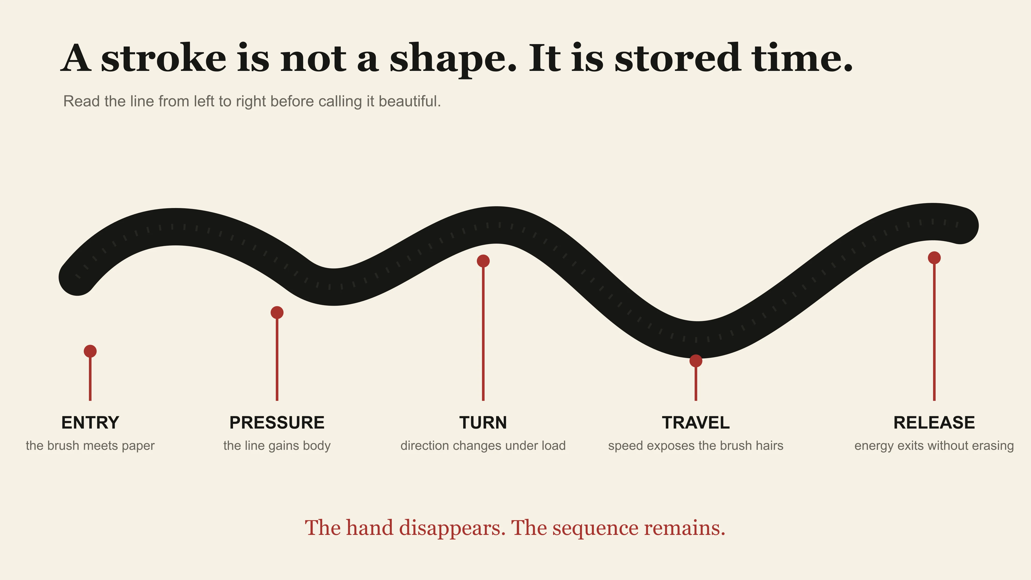
This is East Moment's page-specific looking model, not a historical stroke-order chart. It makes time and pressure visible so a beginner can inspect movement; it cannot identify a calligrapher's intention or authenticate a work.
This is why stroke order matters. It is not merely a classroom rule. The sequence helps the character form through coordinated movement. Change the order and the brush approaches turns and connections differently.
What interests me is continuity rather than theatrical speed. A thin stroke can connect two heavy forms without becoming visually weak. A broad stroke can stop decisively without looking like a correction. Neither achievement requires a spectator to applaud how quickly the writer finished.
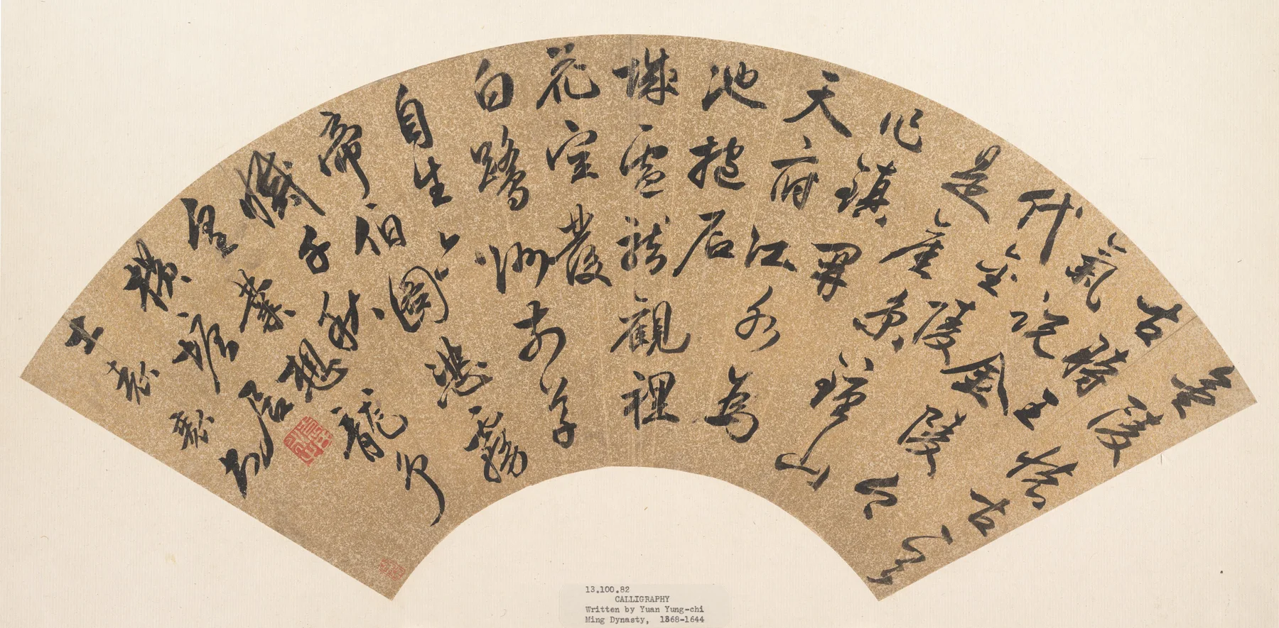
The Met's calligraphy by Yuan Zhi makes that timing visible at page scale. Dark, widening gestures do not float independently; one line loads the next with momentum. Read across the work too quickly and it becomes a dramatic black pattern. Slow down and the drama becomes accountable: entry angle, compression, drag, drying edge and release.
Structure and energy must coexist
A character needs proportion and internal balance. Components relate to one another; empty spaces must breathe; repeated forms should not become mechanically identical. Across a page, characters create larger rhythms through size, ink tone and spacing.
Traditional criticism often speaks of vitality, bone, force or spirit. These terms can become mystical in translation. They point toward visible qualities: whether a line feels weak or supported, whether movement continues through a turn, whether the composition holds together.
Calligraphy rewards close looking because apparent imperfection may carry life. A dry stroke can expose separated brush hairs. A dark pool can result from a pause, a wet brush or absorbent paper. The final mark does not give us a stopwatch: judge pressure and movement alongside the materials, not as a one-to-one forensic code.
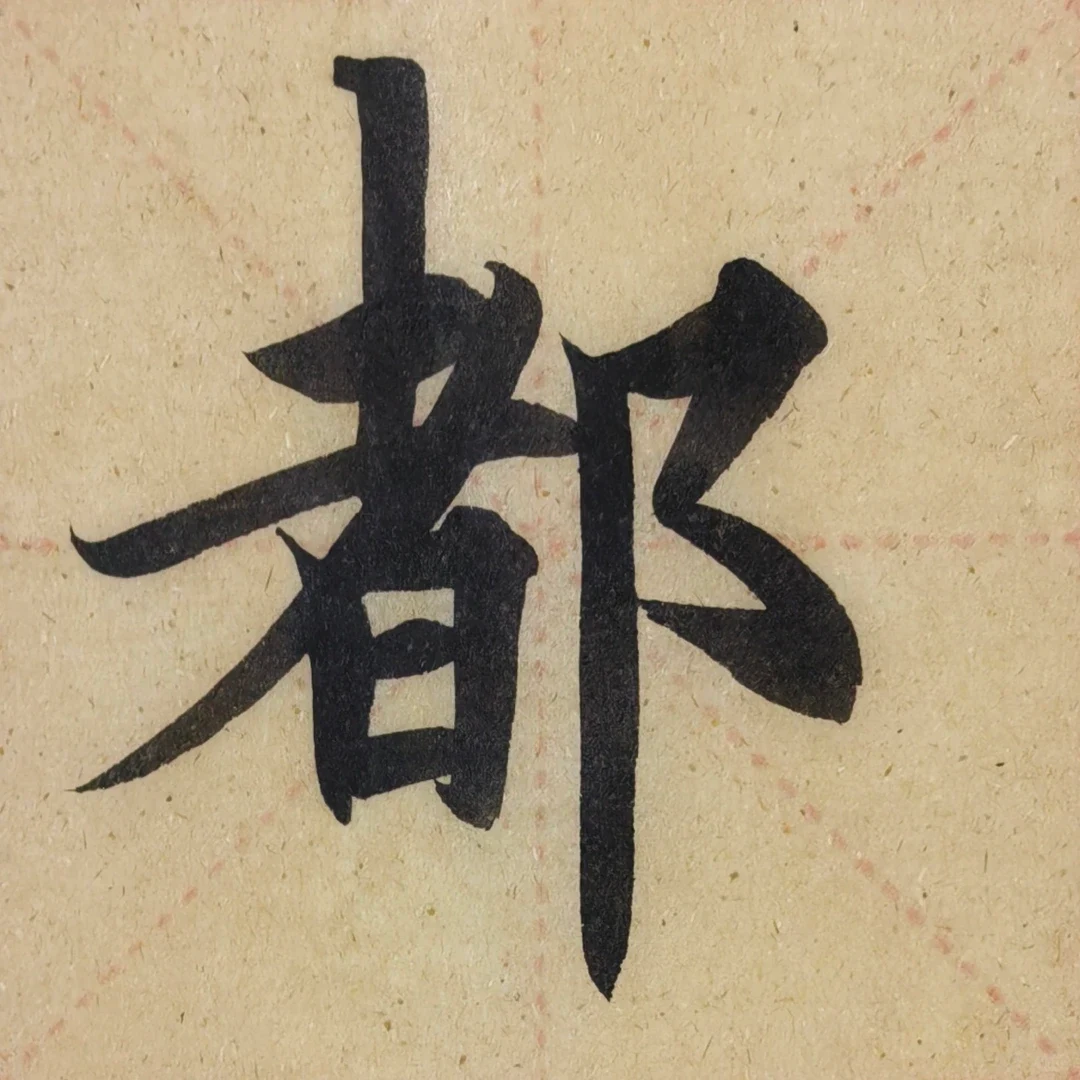
Look at 都 in this practice photograph. The left side, 者, occupies a broad field; the right 阝 component is narrower, with a vertical that descends below the left block. Those unequal widths are the point. Making the two halves equally large would not make the character more balanced. The projecting diagonal on the left and the lower-reaching vertical on the right distribute its weight differently.
The little openings inside the left component matter as much as the thick strokes around them. Fill them with ink and the character becomes clogged. Spread every line equally and it loses its compression. This is a useful beginner's problem because it is visible without pretending to read the writer's personality. I can say exactly what holds my attention: a crowded left side still leaves room to breathe beside a much quieter right side.
This is contemporary practice, not a recovered ancient original. It gives us something a lofty definition cannot: a shape to compare with our own attempts. Keep the photograph as a reference, then inspect how your right-hand component sits relative to the left. Do not turn a single sample into the only correct form of 都 across all scripts or writers.
The words still matter
International design sometimes treats Chinese characters as attractive marks whose meaning is optional. Calligraphy refuses that separation. The writer may copy a poem, compose a letter, record a Buddhist text or write one character as a blessing. Content shapes tone and context.
Before judging brush movement, the Chinese writing system guide helps identify what a character encodes, how semantic and sound components differ, and why a beautiful mnemonic is not automatically an etymology.
Xu Bing's text works offer the necessary contemporary stress test. Book from the Sky preserves the physical authority of print while making conventional reading fail; Square Word Calligraphy makes English recoverable inside a Chinese-character-like square. Neither work makes language optional. Each depends on the viewer bringing a trained reading system to the page.
A vigorous cursive line carrying a private letter is not interchangeable with a formal inscription. A character chosen for a restaurant wall is not automatically profound because it was written with a brush.
Before reproducing a work, identify the text, author, script and source. Decorative admiration becomes more respectful when language is allowed to remain language.
Masters, copies and the life of transmission
Calligraphy history remembers influential writers such as Wang Xizhi and Wang Xianzhi, whose works became models for later generations. Many famous early works survive through copies, rubbings or later transcriptions rather than untouched originals.
Copying is therefore central to learning and preservation. A student studies how an admired line was made by repeating it. The goal is not permanent imitation. Copying trains the eye and hand until informed individuality becomes possible.
Collectors also changed how works survive. Seals, inscriptions, mounting and remounting added new layers. A calligraphic page can be a record of writing and a biography of later attention.

Huang Tingjian's Biographies of Lian Po and Lin Xiangru, dated around 1095 by the Met, gives the eye no single logo-like character to admire. The work is extended time. Dense passages tighten the breath; stretched lines create release; the horizontal format forces the viewer to travel rather than consume the whole object in one glance. A social-media crop of one “beautiful” character may be attractive, but it amputates the pacing that makes the handscroll intelligent.
This is also why copies and fragments demand honesty. A famous name can attract attention long after the exact material relationship to the named writer becomes complicated. “After,” “attributed to,” “copy,” “rubbing” and “later inscription” are not annoying museum qualifiers. They are part of the object's biography. Removing them creates a cleaner story and a worse understanding.
Calligraphy, painting and seals
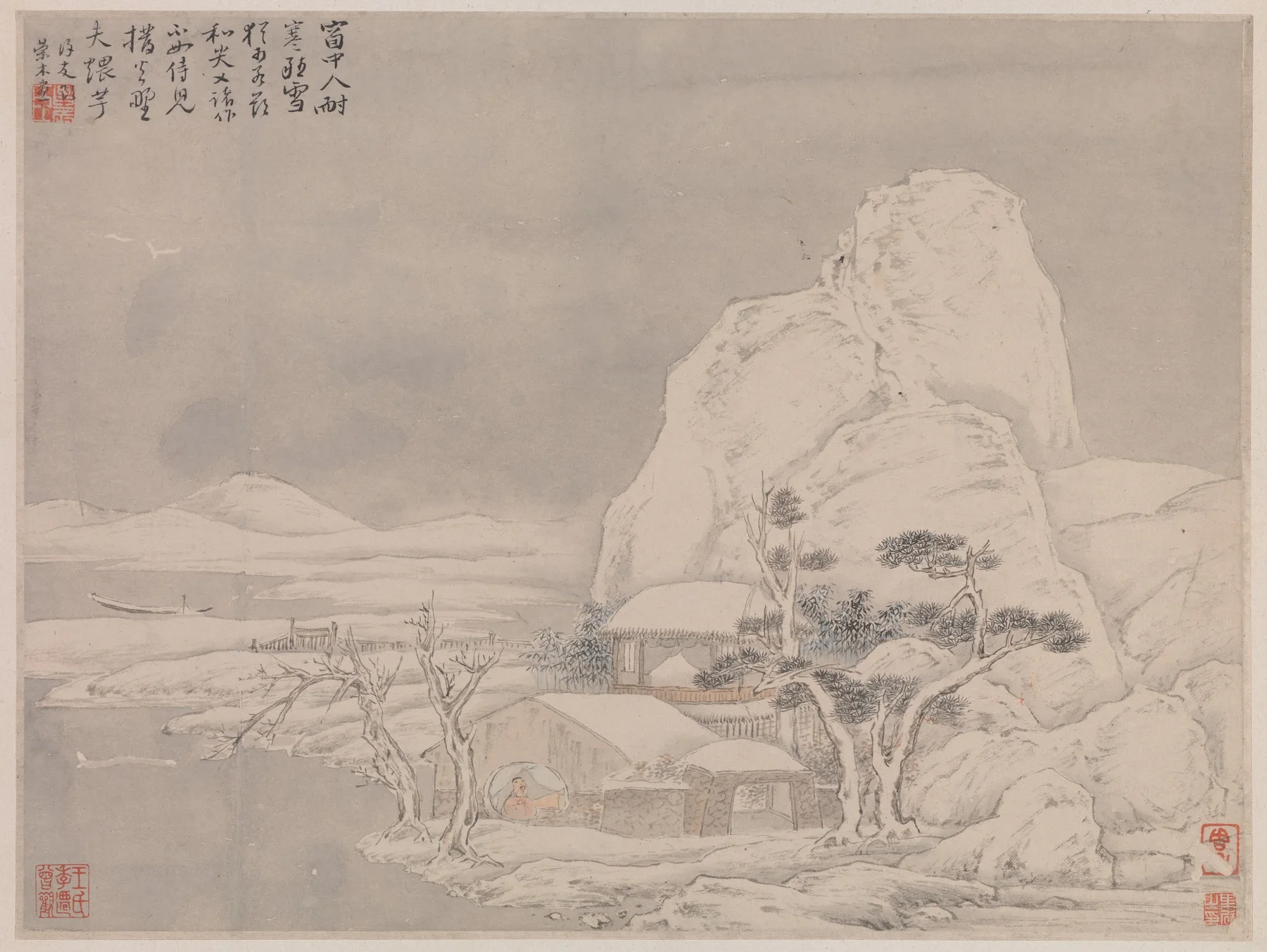
Chinese painting and calligraphy share brush, ink and habits of line. In literati traditions, poetry, calligraphy, painting and seals can occupy one surface. An inscription changes the balance of a painting; a red seal gives a small block of color and a statement of identity or ownership.
The Chinese folding fan intensifies that relationship. Its spaces widen away from the pivot, and the entire work can vanish when the owner closes it. Yuan Zhi's work at the top of this page is itself a fan leaf mounted in an album. That label matters: we are looking at writing shaped for a fan, not watching an intact mechanism open. On an assembled fan, folds and changing light add another rhythm to the ink.

Wang Duo's 1641 Poem written on Mount Qingliang climbs and drops through a narrow vertical field. The format makes gravity part of composition. Characters do not simply follow one another; they lean, bunch, open and recover while the viewer's eye falls down the hanging scroll. Compare that bodily descent with Huang Tingjian's lateral handscroll journey. “Chinese calligraphy” contains both, but the viewing experience is not interchangeable.
The relationship also travels into Chinese porcelain, architecture and everyday design. Characters become part of objects while retaining linguistic meaning. Chinese art often asks image and writing to share the same room. That does not authorize designers to use an unidentified character as atmospheric texture. If the word is wrong, inverted or nonsensical, the visual composition has failed because language was one of its materials.
Printing changes the problem from one unrepeatable brush sequence to a reversed structure that another hand can ink again. The Chinese woodblock printing guide follows that transfer through carving and proofs, where a calligraphic line must remain alive while becoming durable enough to reproduce.
How to look at Chinese calligraphy
Begin from a useful viewing distance. Notice the whole composition: where does it feel dense, open, fast or still? Then move closer.
Follow one line. See where the brush presses, turns and lifts. Compare repeated characters. Look at the empty paper between them. Ask what script is being used and what the text says. Check whether the work is an original, copy, rubbing or reproduction.
Do not begin by asking whether it is “beautiful.” Begin by asking what the hand is doing. Beauty becomes more specific once movement is visible.
Learning without turning characters into decoration
Start with posture, brush holding, basic strokes and regular-script structure under a qualified teacher or reliable course. Learn the character being written, including its meaning and standard form. Practice on inexpensive paper before developing strong opinions about rare inkstones.
Calligraphy is difficult in a useful way. It slows the distance between intention and consequence. A page can reveal impatience more honestly than the person holding the brush would prefer.
That difficulty is also why copying a printed symbol with a brush is not yet calligraphy. The learner must understand the character, sequence the strokes and coordinate the whole body closely enough that pressure changes without losing structure. Practice is not a path toward decorative perfection. It is training in how to make a decision without erasing the evidence of making it.
What to do when the famous work still looks ugly
You are allowed not to like it. I dislike the idea that a beginner must first surrender their eyes to a famous signature. But a useful objection names something visible. “The right side collapses into the next column” begins a conversation; “any child could do it” usually ends one before it starts.
Separate three questions. Can you identify the characters? Can you follow how the forms belong to a script tradition? Do you enjoy the result? These answers need not agree. A reader can recognize excellent control and still prefer a quieter composition. A reader who cannot decipher cursive can still compare the spacing, but needs a transcription before judging how the writing handles its text.
There is an equally lazy mistake on the other side: defending every awkward mark as genius. An unexplained appeal to “spirit” is no better than dismissing every abbreviation as scribble. Ask the defender to point to a turn, a repeated component or a relationship between columns. That is where an aesthetic claim becomes teachable.
A practice session that produces a useful second page
Choose a small, readable regular-script model with a transcription. 临帖, lintie, means working from a model placed where you can study it; it is not simply filling empty squares. 摹, mo, commonly involves tracing or transferring forms. Both can teach, but they train different kinds of attention. A line traced accurately does not prove that you can organize the same character without the guide underneath.
Write one character a few times, then stop. Compare the largest internal space, the longest stroke and the position of the final component. Choose one discrepancy for the next attempt. If you alter brush size, paper, ink dilution and writing speed all at once, you will not know which change helped. Hold the materials steady while testing one structural decision.
Keep the first sheet beside the second. Improvement may be a cleaner gap rather than a more dramatic stroke. This is the kind of progress I value: the writer can explain why the new version works. Ten pages produced without looking back can simply rehearse the same misunderstanding.
For a classroom explanation, connect that act of copying to learning and transmission through our Chinese language and culture AP guide. Use it as a cultural reasoning exercise, not as an excuse to claim that every Chinese student learns the same art or that careful brushwork proves someone's moral character.
The line keeps the hand present
Chinese calligraphy survives because writing can carry more than information. It preserves a sequence of pressure and release, discipline and temperament. Centuries later, the hand is absent and the movement remains.
Continue with the larger Chinese Art guide, learn how characters work in Chinese Language or explore the motifs surrounding written forms in Chinese Symbols. In the comments, choose one line and name the exact moment it gains or loses force. Then annotate one brush line in Moments with entry, pressure, turn and release. Return to compare how other readers follow the same movement; disagreement over where a line changes is more revealing than another photograph captioned “beautiful Chinese writing.”