There is no objectively best Pop Mart character. Choose the visual language you would still want to see after popularity, rarity and social attention are removed; then choose the physical format that fits how you intend to display, carry or handle it. If you cannot explain both choices in one sentence, you are not ready to choose a series.
Pop Mart characters: choose an IP before choosing a box
People often search Pop Mart's current United States character filter as though recognition will produce a ranking. It will not. A list can tell you that HIRONO, DIMOO and MOLLY exist. It cannot tell you which face will still hold your attention after the reveal video, sold-out notice and resale price disappear.
The useful comparison is not “cute versus not cute.” Most Pop Mart characters can become cute, dark, seasonal or collaborative under the right art direction. The more durable differences are deeper:
- visual engine: the recurring shape, face or contradiction that keeps the IP recognizable;
- emotional register: what the character lets you feel without requiring a complete story;
- silhouette: what remains readable at normal shelf or bag distance;
- world range: how far the character can travel across themes without losing identity;
- physical relationship: whether the object is strongest as a fixed scene, carried companion, tactile plush or room-scale focal point.
Use those five dimensions first. Only then should you compare a specific series, product format and price.
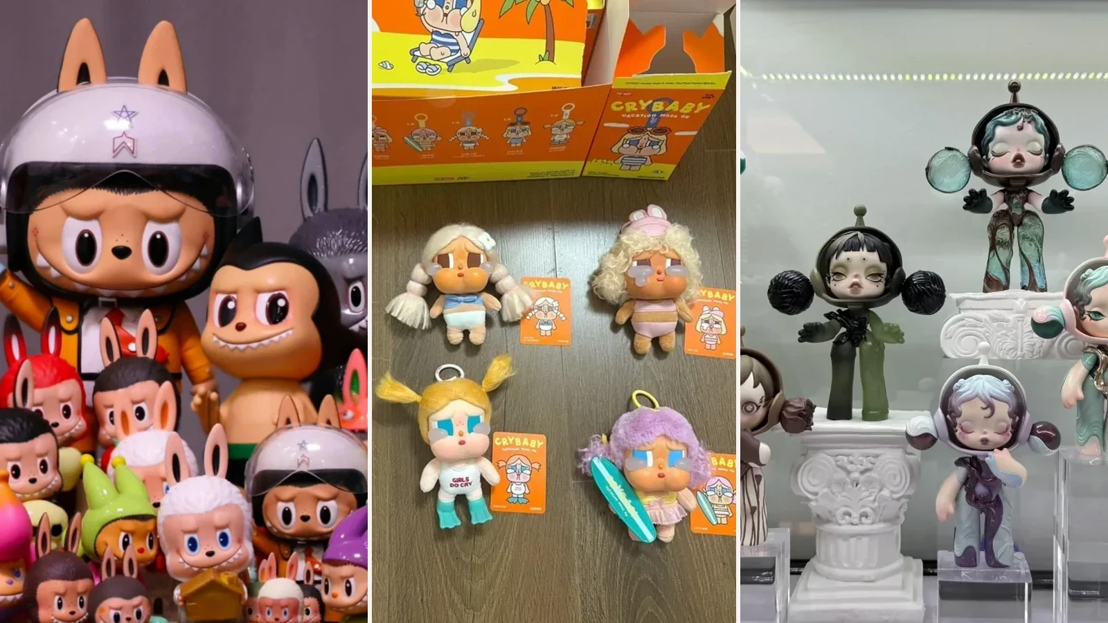
The authorized three-part photograph in the opening makes the distinction visible. THE MONSTERS is legible through ears, teeth and creature variation. CRYBABY uses tears and exposed emotion as its stable signal. SKULLPANDA keeps a recognizable face while costume, era and environment transform around it. None is “more artistic” because it photographs well. They offer different kinds of recognition.
The comparison table: which Pop Mart character fits you?
This is a selection map, not a popularity ranking. “Best for” means the visual and ownership relationship is likely to fit, not that every release from the IP will succeed.
| Character or IP | Visual engine | Emotional register | Shelf read | Best fit | Predictable mismatch |
|---|---|---|---|---|---|
| THE MONSTERS / Labubu | Long ears, pointed teeth, creature costumes and a mischievous face | Mischief, appetite, motion and unruly warmth | Extremely strong silhouette, especially in larger or plush forms | You want a character that can feel wild, comic and companionable | You want restrained expressions or a quiet, minimal shelf |
| SKULLPANDA | One reserved face transformed through costume, material, era and scene | Distance, self-invention, theatrical control and ambiguity | Strong head shape; fine series detail rewards closer viewing | You enjoy fashion, art direction and changing identities | You need one fixed biography or an openly cheerful expression |
| HIRONO | Small human figure, downturned or guarded posture and narrative props | Vulnerability, loneliness, memory and inward observation | Moderate silhouette; pose and object details carry much of the meaning | You want a miniature emotional scene rather than a mascot | You view from far away or dislike melancholic storytelling |
| CRYBABY | Visible tears, flushed face and emotionally exposed pose | Sadness, relief, frustration, tenderness and permission to cry | Face remains readable; plush expands the emotional gesture | You want emotion stated clearly rather than hidden behind coolness | Tears feel repetitive to you, or you want emotional neutrality |
| DIMOO | Childlike figure, cloudlike hair and dream-world companions | Curiosity, sleep, wonder and gentle uncertainty | Soft rounded silhouette; series color and props matter | You want a dreamlike world that can move between calm and playful | You need sharp contrast, aggression or a very adult visual tone |
| MOLLY | Pouting mouth, wide eyes and a stable childlike face | Confidence, stubbornness and self-possession | Highly recognizable face, often strengthened by iconic costume | You value the history of a long-running character and bold costume translation | The fixed pout does not connect with you, however strong the collaboration |
| Twinkle Twinkle | Star-like child form, simplified face and rounded softness | Reassurance, optimism and uncomplicated comfort | Clear at a distance, especially in plush and larger forms | You want a warm room companion rather than an intricate miniature narrative | You prefer tension, irony or visual complexity |
| Nyota | Quiet childlike figure with celestial, natural and contemplative cues | Stillness, solitude and soft wonder | Gentler silhouette; benefits from breathing room and close viewing | You want a low-volume, reflective display | You want an instantly loud bag charm or high-contrast shelf anchor |
| KUBO | Boyish figure shaped by changing urban, costume and story settings | Adventure, imagination and youthful role-play | Series-dependent; costume and pose often lead | You enjoy narrative variety but still want a human figure | You want one unmistakable silhouette across every release |
| Peach Riot | Three-girl band identity, expressive styling and attitude | Friendship, performance, defiance and group chemistry | Strongest as a group or scene rather than one isolated face | You want characters whose relationships matter as much as individual design | You want one mascot-like figure that carries the whole IP alone |
Two cautions make the table useful rather than absolute. First, a strong series can bend the normal register of an IP. Second, physical format can change the relationship more than the name does. A small hard figure and a large plush version of the same character do not occupy the same emotional or spatial role.
What the major characters actually offer
THE MONSTERS and Labubu: recognizable energy
Labubu belongs to THE MONSTERS, the world created by Kasing Lung. The most durable attraction is not celebrity visibility and not the price of a particular pendant. It is the tension between a creature silhouette and an emotionally readable face: long ears, a broad mouth, pointed teeth and a body that can move through animal suits, fantasy scenes, hard figures and soft formats.
Choose this world when you want the object to announce itself quickly. Ears and teeth survive distance, clutter and small phone images. That makes Labubu effective as a bag object and as a shelf anchor. It also explains the main mismatch: visual volume can become tiring in a restrained room, and carrying a textile object creates wear that display-only buyers may not accept.
The full identity, creator relationship and format distinctions belong in the Labubu guide.
SKULLPANDA: identity through transformation
SKULLPANDA is the strongest choice here for a buyer who follows art direction more than plot. The face remains controlled and recognizable while hairstyle, head structure, costume, surface, implied era and environment change. A complete series can function like a small exhibition with one model passing through many identities.
This range creates both value and risk. The best series hold together through a clear visual rule. The weakest purchase is one made because a single design photographed well while the rest of the basic lineup was unacceptable. Compare whole worlds, not isolated secrets. The SKULLPANDA guide provides the full series test.
HIRONO: a scene you lean toward
HIRONO is less dependent on a loud mascot silhouette. The figure often reads through lowered posture, guarded expression, worn or symbolic objects and a scene that appears to have happened before the viewer arrived. The appeal is narrative compression: one small body and a few props imply memory, disappointment, repair or escape without closing the story.
That makes HIRONO particularly effective at close viewing. It also makes placement important. On a crowded high shelf, subtle hands, objects and posture disappear. Give it eye-level space, directional light and less aggressive neighbors. If you need a character to remain legible across a room, choose a stronger silhouette or a larger HIRONO format rather than blaming the sculpt.
CRYBABY: emotion is the system
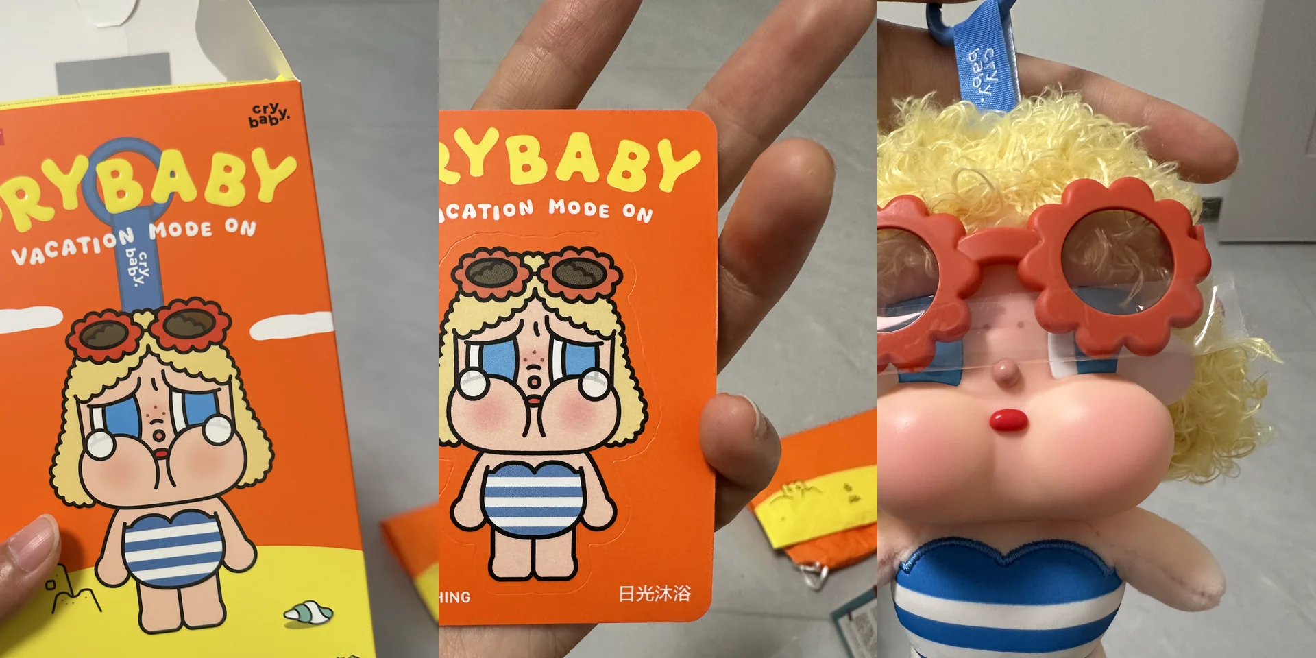
CRYBABY does not hide the feeling and wait for the owner to decode it. Tears, flushed features and compressed poses turn crying into a flexible visual vocabulary. Depending on the scene, the same stable signal can carry grief, fatigue, protest, embarrassment, tenderness or release.
Choose it when visible emotion feels honest rather than sentimental. Avoid it when the tear motif already feels like an instruction telling you what to feel. Plush can intensify the desire to comfort and carry; hard figures preserve more of the exact pose and scene. The CRYBABY guide separates those relationships in detail.
DIMOO: a world built from curiosity
DIMOO's center is not one dramatic emotion but a dreamlike condition. Rounded child proportions, soft hair or cloud forms, gentle creatures and changing environments let the character move between play, sleep, space, weather and imagined travel.
The strongest reason to choose DIMOO is world continuity. Different designs can feel like episodes inside a broad imaginative landscape without requiring one literal biography. The risk is softness without focus. Before buying, reduce the lineup to small thumbnails. If every design becomes an indistinct pastel mass, the series may need more space and closer viewing than you have.
Searchers sometimes type dimmo popmart; current official portfolio records use DIMOO. Treat DIMMO as a misspelling, not a separate character.
MOLLY: the face that holds the costume
MOLLY, created by Kenny Wong, is one of Pop Mart's foundational artist characters. The stable pouting mouth and wide eyes allow costume and collaboration to change while the face keeps authorship visible. Compared with SKULLPANDA's emotional reserve, MOLLY often feels more self-possessed and direct.
Choose MOLLY if the fixed expression already works for you. Do not expect a new costume to repair a face you do not enjoy. This rule sounds obvious, but product photography encourages buyers to focus on accessories, licensed references or edition language while ignoring the feature they will see every day.
Twinkle Twinkle: comfort with a strong outline
Twinkle Twinkle is built for immediate warmth. The star-like form and rounded proportions make the character readable with fewer small narrative details. That can be an advantage in a room: a clear outline survives ordinary viewing distance and works across soft and larger formats.
Its main strength is also the selection test. If uncomplicated comfort is what you want, do not apologize for choosing it over a more elaborate series. If you need contradiction, melancholy or fashion-level transformation, the same simplicity may become visually thin after the first reaction.
Nyota: quiet needs room
Nyota is a better route for collectors who want a lower-volume object. Celestial, natural and contemplative cues often ask for slower looking. That relationship can be lost when the figure is treated as one more unit in a saturated wall.
Choose Nyota only if you can protect quiet around it. This does not require an empty room; it requires contrast, a little negative space and neighboring objects that do not erase the silhouette. A small collection can be more coherent than a complete lineup if each figure remains visible.
KUBO: narrative role-play
KUBO tends to gain identity from the role, costume and world of a release. This can suit a buyer who enjoys a human figure moving through changing stories but wants less emotional exposure than CRYBABY and less fixed melancholy than HIRONO.
The selection risk is series dependence. If costume does most of the recognition work, do not assume affection for one KUBO release transfers automatically to another. Compare the uncostumed face, body proportion and pose language before deciding that the IP itself, rather than one theme, is the attraction.
Peach Riot and the group alternative
Peach Riot changes the decision because the unit is not simply one mascot. The three-girl band framework makes relationship, styling and performance part of the visual system. A group display can create energy that an isolated figure cannot reproduce.
Choose it when chemistry matters. Avoid buying one member only because that is what remains available if the group relationship is the real source of interest. Display footprint and total-series cost deserve attention before the first purchase.
Do not confuse character, series, design and format
Most first-buyer confusion comes from treating four layers as synonyms.
| Layer | Example | Decision it answers |
|---|---|---|
| IP or character system | DIMOO | Which recurring visual and emotional language do I want? |
| Series | One themed DIMOO blind-box release | Which shared world and basic lineup do I accept? |
| Design | One named figure within that lineup | Which exact pose, costume and color do I prefer? |
| Format | Hard figure, plush pendant, doll or larger object | How will I view, carry, touch and store it? |
This distinction prevents a common false conclusion: “I like one photograph, therefore I collect this character.” You may like one design, one collaboration or one material treatment. Test the stable face and silhouette across at least three unrelated series before calling it an IP-level preference.
Real displays show that taste becomes a space problem

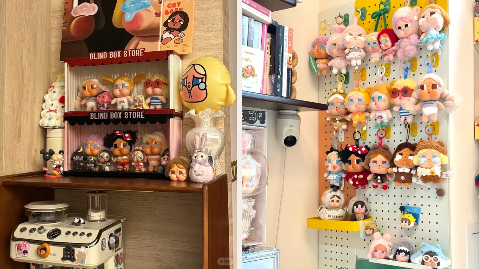
These three real displays do not prove one correct way to collect. They show why character choice cannot be separated from physical space.
- Labubu: repeated ears create strong rhythm, but large and small forms compete unless the cabinet establishes levels.
- CRYBABY: a wall system suits hanging plush, while hard figures need stable horizontal surfaces; one IP can require two storage logics.
- SKULLPANDA: similar faces remain distinct because risers, gaps and lighting protect costume and pose.
The practical conclusion is firm: choose a display relationship before you choose quantity. A visually quiet character can disappear inside a dense cabinet. A large plush can dominate a small room. A pendant can look perfect in a product image and deteriorate rapidly under daily friction. None of those outcomes is solved by buying a rarer version.
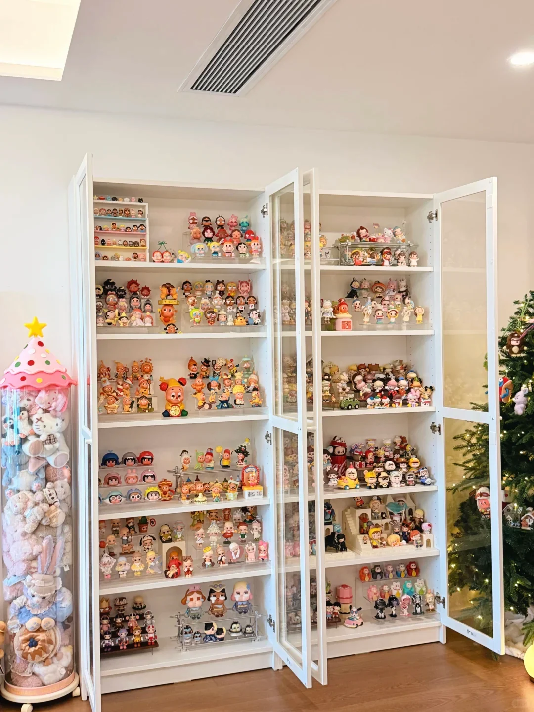
This open-cabinet view catches the decision that cropped product pictures hide: at ordinary room distance, character families compete as blocks of color, repeated heads and shelf rhythm. The strongest shelf is not necessarily the one with the rarest figure. It is the shelf where one family remains readable without swallowing its neighbors. Door swing, riser height and the empty strip above a lineup are not boring storage details; they decide whether the collection can still be seen, removed and cleaned. The photograph cannot authenticate any object or tell us what the owner paid. It can prove that choosing a character eventually becomes choosing how much visual territory that character is allowed to occupy.
Hard figure, plush, pendant or large object?

Format changes the relationship even when the face remains the same.
Hard figure: strongest for reading art direction
Hard figures preserve exact pose, sculpted props, surface transitions and bases. They are the best starting format when your main interest is how a series constructs a miniature world. They also demand stable shelves, dust access and care around thin or extended parts.
Plush: strongest for touch and room presence
Plush softens the outline and increases apparent volume. It can make an emotionally distant face feel companionable, but textile pile, pale fabric and stuffing respond to compression, oils, dust and humidity differently from a hard figure. “Collectible” does not make textile wear disappear.
Pendant: strongest for public carrying
A pendant turns private taste into a carried signal. That makes silhouette and attachment more important than tiny sculptural detail. Decide whether the goal is daily carry or display condition. Frequent bag use and untouched condition are conflicting goals.
Large object: strongest as a room anchor
Large objects can make a single character more effective than a crowded set. Measure width and depth as well as height. Plan where the object goes during cleaning, travel or a room change. A purchase does not fit merely because it fits on delivery day.
The seven-step first-character test
Do this before comparing prices.
1. Remove the popularity signal
Hide like counts, celebrity photographs, sold-out badges and resale listings. If the character loses all attraction, attention was doing the work.
2. Compare three unrelated series
Use three releases with different themes. Identify what survives: face, silhouette, posture, emotional tone or world logic. That surviving relationship is the actual IP.
3. Use the least-favorite design test
For each series, count the basic designs you would willingly own. Ignore the secret. A blind box is reasonable only when the least-preferred disclosed outcome is acceptable enough for the price and space.
4. Shrink the image to real viewing distance
View the lineup at the approximate size it will occupy from your chair, doorway or desk. If only color remains visible, decide whether color alone is enough. Fine detail cannot rescue an object you never inspect closely.
5. Name the physical relationship
Finish one phrase: I will display it at eye level, carry it three days a week, handle it at my desk, or use it as one room anchor. Vague ownership produces format mistakes.
6. Measure the complete footprint
Include base, ears, hair, headpiece, forward props and removal clearance. For a group, include breathing room. Shelf capacity is the number of objects that remain visible, removable and cleanable, not the maximum number that physically fit.
7. Write the decision sentence
Use this exact structure:
I choose ___ because its recurring ___ still works without hype, and I will own it as a ___ in ___.
Example: “I choose HIRONO because its guarded posture and small narrative objects still work without hype, and I will own it as one hard figure at eye level on my desk.”
If the first blank contains only “popular,” the character choice is unresolved. If the last two blanks are empty, the format and space choices are unresolved.
Three useful routes instead of one winner
If you still cannot decide, reduce the portfolio to three routes.
Choose by silhouette
Start with THE MONSTERS/Labubu or Twinkle Twinkle when you need immediate recognition at room or bag distance. Strong outline matters more than miniature detail in that setting.
Choose by emotion
Start with CRYBABY when you want feeling stated openly, or HIRONO when you prefer a quieter scene that leaves more unsaid. SKULLPANDA sits between them: emotionally reserved but visually theatrical.
Choose by world-building
Start with DIMOO for dream continuity, SKULLPANDA for identity transformation, KUBO for role-play, or Peach Riot for group chemistry. Compare complete lineups because the world, not one face, carries much of the value.
These routes are more honest than a top-ten list because they expose the reason for the choice. They also leave room for a valid result: none of the current characters fits you. Not buying is a successful decision when the visual language or physical relationship is wrong.
What names and pictures cannot prove
Pictures help with recognition, but they have strict limits.
- A product photograph cannot tell you whether a textile object will tolerate your carrying habits.
- A collector photograph cannot authenticate another item by appearance.
- A complete shelf cannot tell you what the owner paid or whether the same density will work in your room.
- A high like count cannot establish quality, scarcity or future value.
- An official artist relationship does not make every release equally resolved.
- Company revenue shows commercial scale, not the best character to buy.
For sealed boxes, confirmed items, transaction evidence, authenticity boundaries, duplicates, condition and spending limits, use the Pop Mart collecting guide. Those are operational decisions, not character comparison.
The final decision
The best Pop Mart character is not the one with the highest company revenue, search volume, resale listing or social engagement. It is the one whose recurring visual logic survives three tests: you still recognize it across unrelated series, you still want it without the attention signal, and its physical format has a clear place in your life.
Start with one character, one exact object and one defined relationship. Let ownership teach you whether the attachment is to the IP, the series, the format or merely the reveal. That knowledge is more valuable than completing a lineup you did not truly choose.
For the company and IP system, read what Pop Mart is. Continue to the dedicated guides for Labubu, CRYBABY and SKULLPANDA when one of those visual languages passes your first test. If two names still compete, bring a normal-distance, two-character comparison to East Moment's community and return after a month to record which one kept speaking when the release noise disappeared.