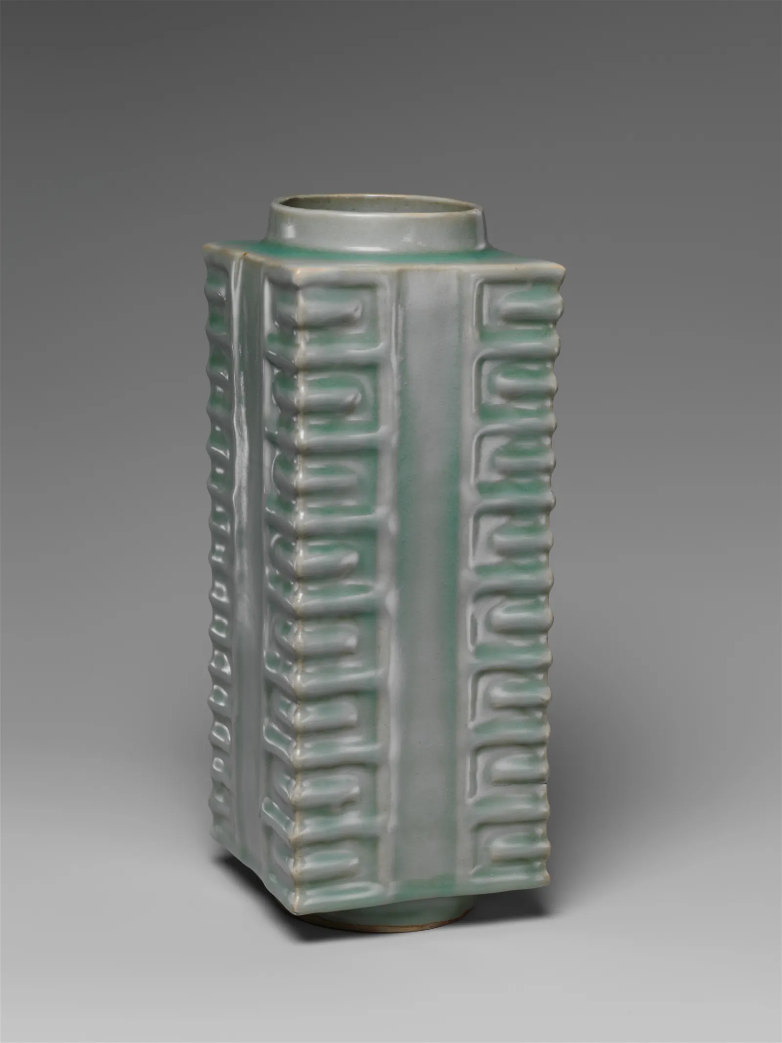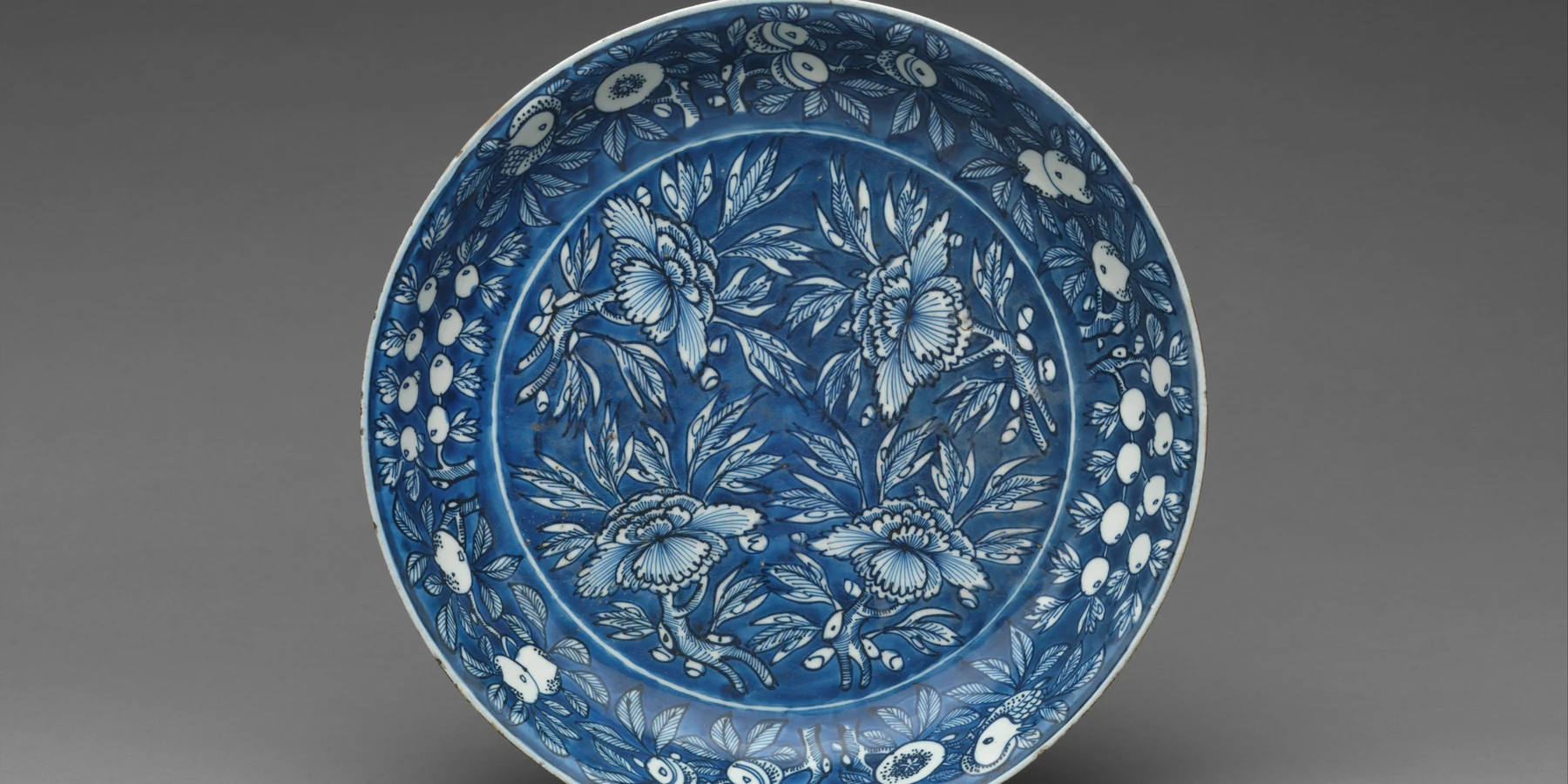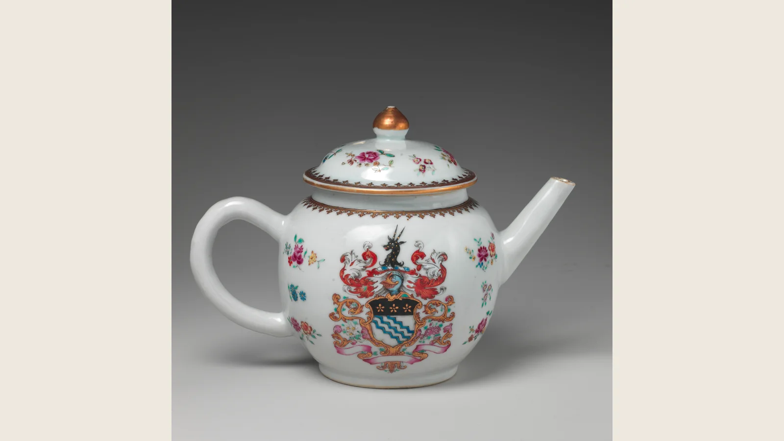
Chinese blue and white porcelain uses cobalt decoration beneath a transparent glaze on a pale porcelain body. The blue is not one flat color. A loaded outline, a diluted wash and an untouched strip of porcelain can make a leaf turn without adding green. That is what I want you to notice before memorizing dragons and dynasty names.
I lose interest when every part shouts at the same volume. The blue-and-white work I admire knows where to hold back. A pale petal beside a dark stem can be more persuasive than a surface filled with impressive motifs. The painter has to make those small decisions before firing reveals the final blue.
Chinese blue and white porcelain begins with cobalt beneath glaze
Chinese blue-and-white porcelain is porcelain decorated with a cobalt-bearing pigment beneath a transparent glaze. The maker generally paints the design on a dried, unfired body, covers it with glaze and fires the object at high temperature. The pigment develops into blue under the glaze while the pale body supplies the light background.
The direct formula is simple:
| Part of the system | What it contributes | What can change the result |
|---|---|---|
| Pale porcelain body | Bright ground and visual contrast | Materials, refinement, wall thickness and firing |
| Cobalt-bearing pigment | Blue line, wash and tonal depth | Source, processing, concentration and brush loading |
| Brushwork | Rhythm, outline, texture and human variation | Absorbency, pressure, speed and painter skill |
| Transparent glaze | Gloss, protection and optical depth | Thickness, chemistry, bubbles and flow |
| Kiln firing | Vitrifies the body and develops the color | Temperature, atmosphere, placement and cooling |
| Vessel form | Turns a flat image into a moving composition | Curvature, proportions, handles, neck, rim and foot |
Calling it “blue paint on a white pot” misses where the decoration sits and how it was fired. A cobalt-blue glaze covering the whole vessel is a different treatment from a painted cobalt image under clear glaze. A modern blue illustration printed on a mug may belong to the broad visual family without using the same decorating method. Appearance and process need separate names.
The blue does not sit on top like modern acrylic. It lives beneath the glaze. That layer matters because it makes the line feel suspended inside the surface rather than pasted onto it. The glaze can soften edges, deepen dark areas and create a watery optical space between your eye and the brushwork.
This is also why not every blue-and-white ceramic object is Chinese porcelain. Potters across the Middle East, Japan, Korea, Southeast Asia and Europe developed their own blue-and-white traditions. Some used porcelain; others used stoneware, earthenware, tin glaze, transfer printing or industrial decoration. “Blue and white” names a visual family, not one passport.
Cobalt makes the image, but fire decides the final blue
Cobalt gives the style its durable blue under high-fired glaze. The finished tone depends on the pigment mixture and firing conditions, not simply on how bright the raw material looks in a dish.
Before firing, the pigment does not necessarily look like the clean saturated blue you expect from a finished vase. It may appear gray, blackish, purple or dull. The painter is working toward a color that is not fully visible yet.
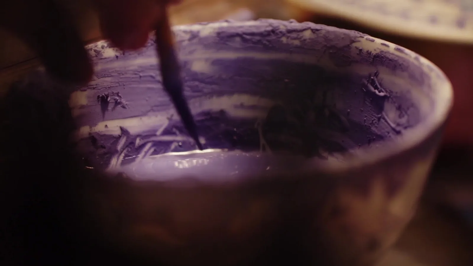
The absorbent body makes the mark behave differently from paint on a sealed sheet. The painter must manage how much liquid arrives, where it spreads and how it dries. A dark contour and a pale filled area require different control, even when both come from cobalt-bearing material.
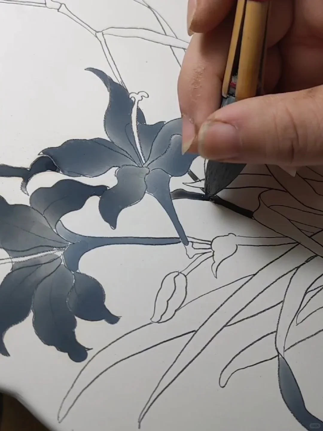
In this contemporary working view, the leaf shapes have already been outlined. The broad brush delivers a wash inside them; some areas are dense, others thin enough to leave the pale ground active. This is the difference between gouxian, drawing the contour, and fenshui, controlling the liquid wash. The gray-blue working color is not the final fired result.
Look at the narrow light passage running along the central stem. Fill it in as dark as the surrounding leaf and the parts merge. Leave it open and the stem separates without a second color. That modest interval is the detail I care about: restraint doing actual work, not “minimalism” attached afterward as a flattering label.
Fenshui is not a requirement that every historical blue-and-white object use the same five concentrations or identical brush routine. Painters and workshops differ. What this photograph lets you understand is the task itself—getting a shaped area to carry tonal variation without losing the drawing. The densely banded Yuan bottle above and a sparsely painted modern cup can solve that task in very different ways.
The final blue is never one universal “porcelain blue.” Cobalt composition, processing, pigment concentration, brush loading, glaze chemistry, kiln atmosphere and temperature all matter. One piece can look smoky and soft. Another can appear violet, inky, spotted or almost black in dense areas. Runny edges may reveal pigment moving under glaze; sharp lines may show a different material balance or painting method.
Color alone cannot date a piece. The internet loves shortcuts such as “dark blue means Yuan” or “bright blue means modern.” Those rules collapse when recipes change, kilns vary, later makers imitate earlier effects and photographs distort color. Blue is evidence. It is not a timestamp.
Jingdezhen turned a difficult craft into a creative industry
Jingdezhen in Jiangxi connected ceramic materials, skilled workshops, firing and distribution. Its importance cannot be explained by one legendary master or one secret recipe. For the distinction between material, place and style, start with the broader Chinese porcelain guide.
Materials could be extracted and refined. Bodies could be formed by throwing, molding or assembly. Specialist painters handled different parts of the decoration. Other workers glazed, trimmed feet, made kiln furniture, loaded kilns, controlled firing, sorted results, packed orders and moved objects into commercial networks.
An outline painter and a wash painter could work on different aspects of decoration; forming, glazing and firing brought further skills. The result could look unified without being the work of one pair of hands. That makes an anonymous vessel more interesting to me, not less deserving of attention.
That system served different customers. Imperial commissions demanded control, symbols and quality suitable for court use. Domestic markets wanted objects across many price levels. Overseas clients requested unfamiliar shapes, decorative arrangements and subjects. Workshops could repeat successful designs while still leaving room for brush variation and technical experiment.
Workshop repetition is not the enemy of a lively brush. It supplies a shared arrangement in which individual marks can still vary. A border repeated around a vessel must hold together at a distance; close up, a turn in a stem or a heavier wash can give it energy. “Handmade” becomes meaningful when you can point to that behavior, not merely read it beside a price.
The full porcelain-making guide follows the process from raw material to kiln sorting. Blue-and-white decoration occupies only one stage in that chain. A brilliant dragon cannot rescue badly prepared clay, rushed drying, distorted form or careless kiln loading.
The Yuan breakthrough was not a quiet beginning
Blue decoration appeared on Chinese ceramics before the Yuan dynasty, but the mature large-scale blue-and-white porcelain tradition associated with Jingdezhen became a major force during the 14th century.
The porcelain history timeline separates that breakthrough from the much earlier development of white porcelain. Blue and white changed the decorated surface; it did not invent the body beneath it.
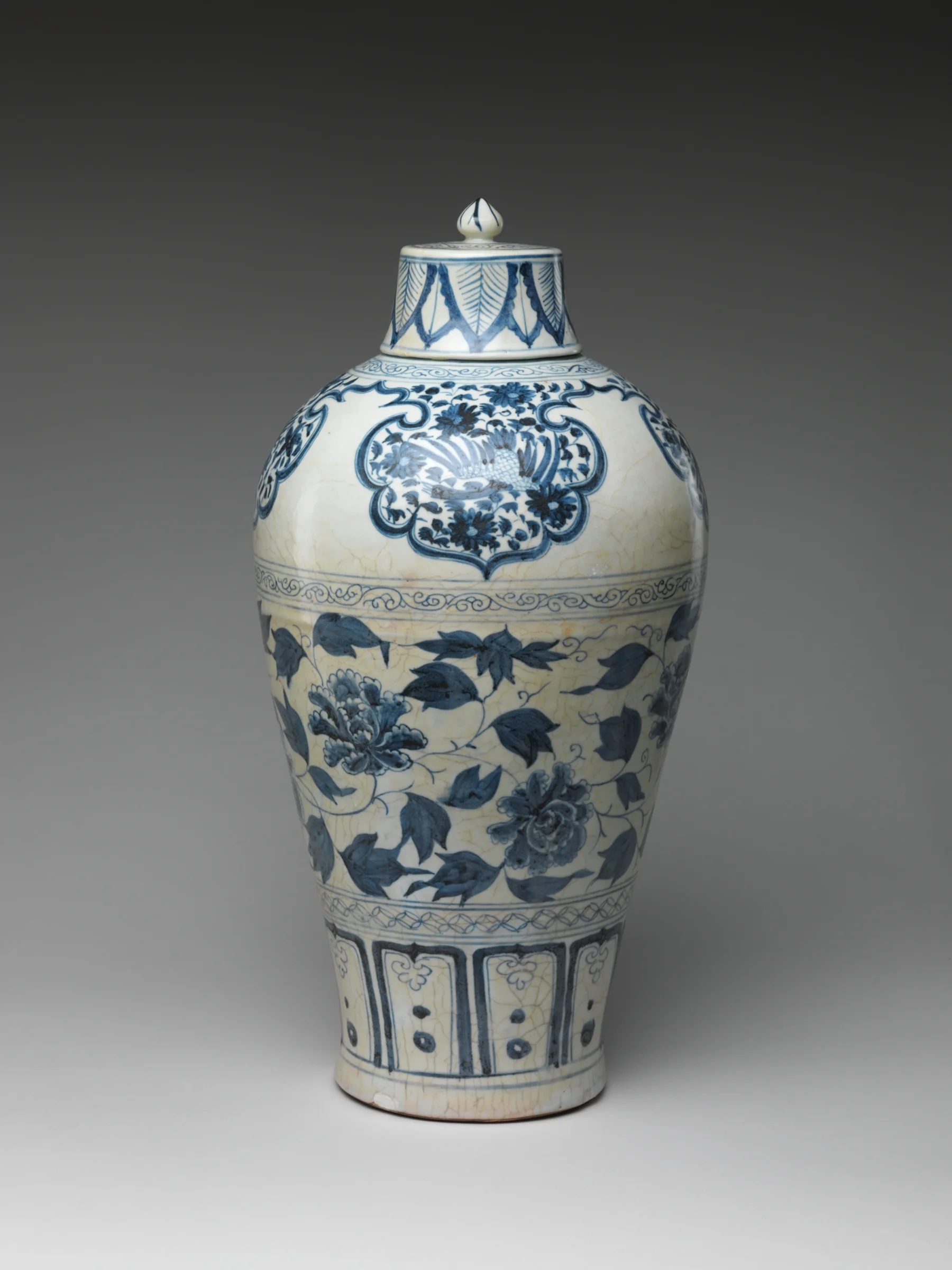
The Metropolitan Museum of Art's mid-14th-century Bottle with Peony Scroll is the right object to study because it destroys the idea that early blue and white had to be timid. The bottle is visually loud, dense and controlled at the same time.
Return to the opening image: Bottle with Peony Scroll, a mid-14th-century Yuan dynasty Jingdezhen porcelain painted with cobalt blue under transparent glaze. The Metropolitan Museum of Art places the whole object in view there; this section reads how its decoration works.
Look at how the decoration is divided. The neck, shoulder, body and lower section do not receive one continuous wallpaper print. Each zone has a job. Narrow borders control transitions. The large peony scroll expands across the broad body. Repeated bands stabilize the top and bottom. Dense painting is balanced by the pale porcelain that remains visible between lines.
This is the first key to reading blue-and-white porcelain: the vessel is architecture.
The painter does not decorate empty space after the pot is finished. The silhouette creates visual neighborhoods. A neck asks for vertical rhythm. A shoulder can carry a collar of petals or scrolling forms. A broad belly can hold a narrative, animal, flower scroll or large roundel. The foot needs a lower boundary strong enough to stop the image from appearing to slide off.
The best blue-and-white decoration makes form and image behave as one object. Weak decoration ignores the curve. Strong decoration uses it.
The design system: borders, panels, roundels and breathing room
The modern pattern studies below separate borders, roundels and open intervals so you can examine their different jobs. Keep the museum vessels nearby in mind: a flat design makes a pattern legible, but the ceramic form determines how much of it you can see at once.

Modern border study: the open center gets its emphasis from the busy edge. East Moment media archive.
A border does more than fill an edge. It tells your eye where one visual zone ends and another begins. A repeated floral band can slow the transition between neck and shoulder. A geometric band can make an unstable curve feel controlled. A circular frame can reserve the center for a flower, animal, character, landscape or blank space.

This narrow modern band shows how a small repeating unit can organize a rim, neck or panel boundary. East Moment media archive.
Roundels solve another problem. A round vessel cannot give every viewer one permanent front. Circular or medallion-like compositions create local focal points as the object turns.
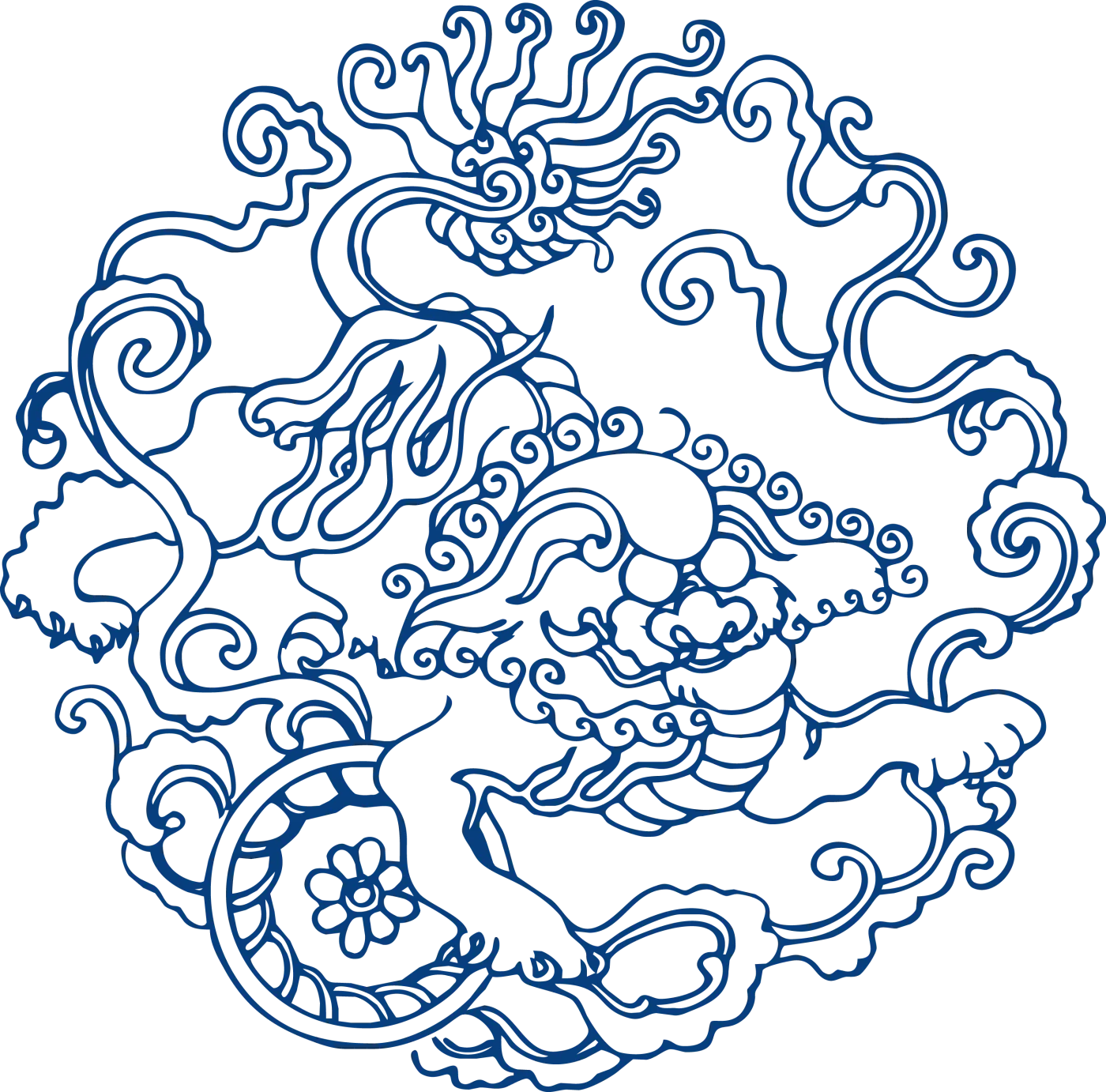
The curled dragon compresses movement inside one roundel. East Moment media archive, modern pattern study.
Panels can divide a surface into episodes. Scrolls can connect zones through continuous movement. Alternating dense and open areas prevent the object from becoming a blue wall. The unpainted body is not leftover space. It is active light.
This is the second key: blue-and-white porcelain depends as much on what the painter leaves untouched as on what the painter fills.
Modern graphic design calls this negative space. Porcelain painters understood the principle through material practice. Too little white and the image becomes heavy. Too much white without structural intention and the decoration floats without authority. The most convincing work sets blue pressure against white release.
Flowers, dragons and fish are not a universal secret code
Chinese porcelain patterns often carry meaning, but the internet turns that fact into a bad game: identify one motif, receive one fixed translation.
The broader Chinese porcelain patterns guide separates this compositional question from cobalt history. It shows how a scroll, spray, reserve, medallion or border behaves on porcelain whether the decoration is blue, enamelled, incised, moulded or left in reserve.
Peony equals wealth. Dragon equals power. Fish equals abundance. Bamboo equals resilience. Done.
No. Those associations can be useful starting points, but an object still has a period, patron, market, form, inscription, surrounding motifs and intended use. A dragon on an imperial object does not operate exactly like a dragon on a modern restaurant plate. A peony painted for court, export, wedding display or contemporary packaging enters a different conversation each time.

Modern peony study: layered petals make a dense center, while curling leaves draw attention outward. East Moment media archive.

The bamboo study uses thinner, more open marks than the peony. Compare their visual weight before naming either symbol. East Moment media archive.
The Met's early-16th-century bowl is more useful than any symbol list because its lotuses do not behave like detachable icons. The flowers, leaves and scrolling stems keep pulling the eye around the curved well. Their identity matters, but so do scale, repetition, placement and the way the design meets the vessel.
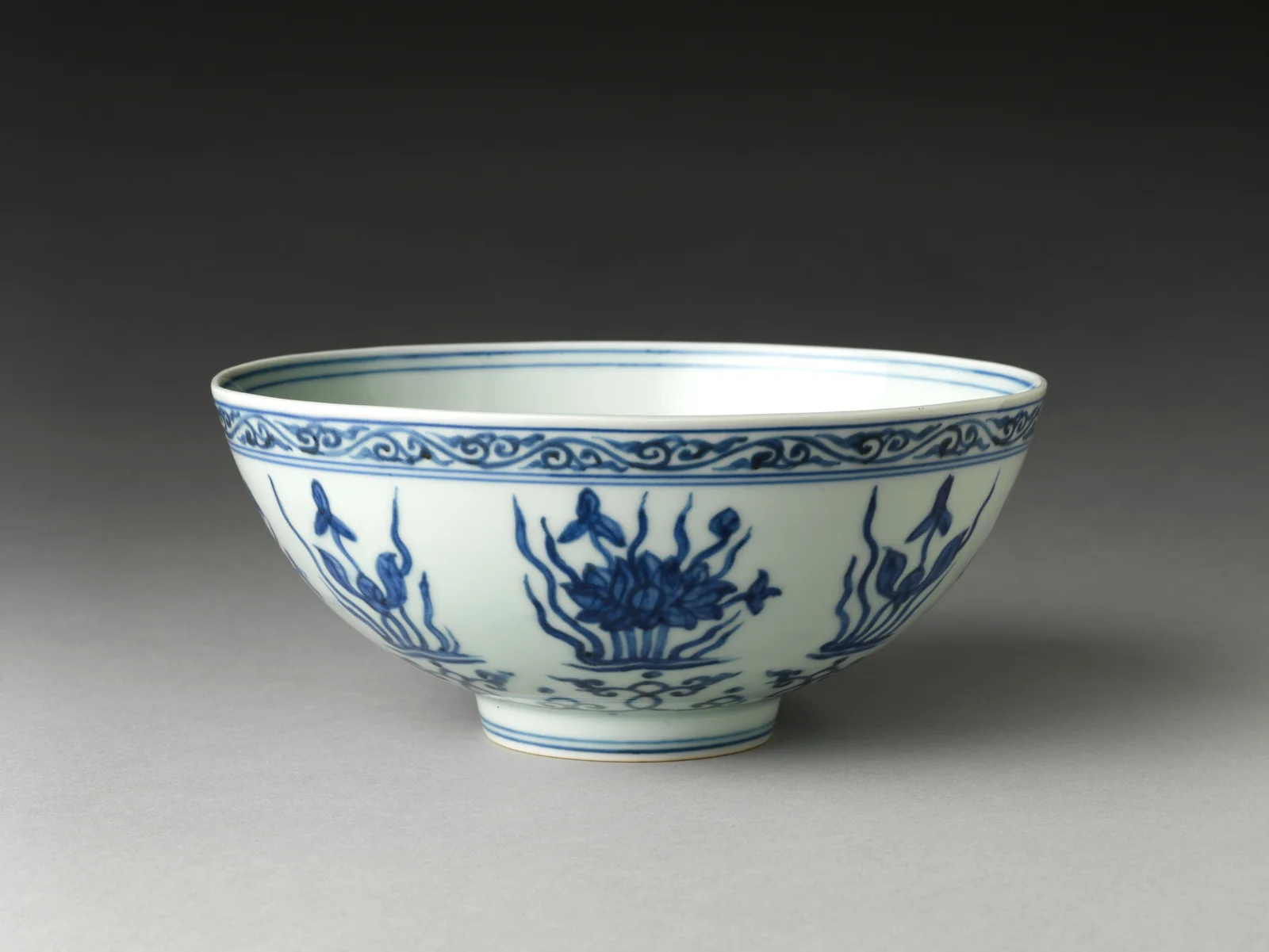
Bowl with Lotuses, Zhengde mark and period, 1506–21. The Metropolitan Museum of Art, public domain.
My rule is strict: read motifs as relationships, not stickers. Ask what sits at the center, what repeats, what surrounds the main image and where the object would be used. Meaning is built by the entire composition.
A dragon proves why movement matters more than a motif label
The Met's early-15th-century Jar with Dragon contains an animal everyone recognizes, but recognition is only the beginning.
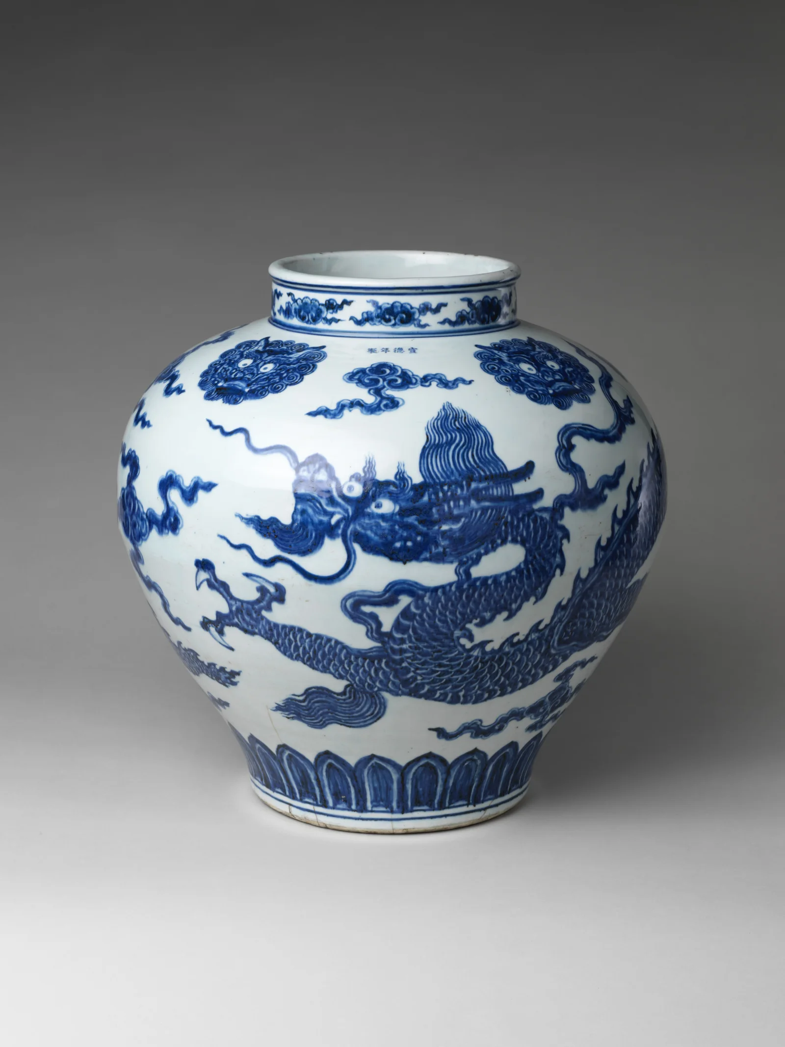
Jar with Dragon, early 15th century, Xuande mark and period, Jingdezhen ware. The Metropolitan Museum of Art, public domain.
Do not stop at “dragon means imperial power.” Watch the body move.
The dragon stretches around the jar rather than posing inside a flat rectangle. Its claws, spine, tail and surrounding cloud forms create directional energy. As you walk around the vessel, parts disappear and return. The viewer must move to complete the image.
This is why blue-and-white porcelain photographs can be misleading. A single front view freezes an object designed for rotation. Handles hide motifs. Curves compress figures. A roundel that looks centered from one angle may belong to a sequence around the body.
When a museum provides several views, use them. When you see a piece in person, circle it. Porcelain is not a screenshot.
The archive's bird-and-flower composition demonstrates the same relationship in a modern graphic form. The bird creates directional attention while branches and blossoms fill the surrounding field.
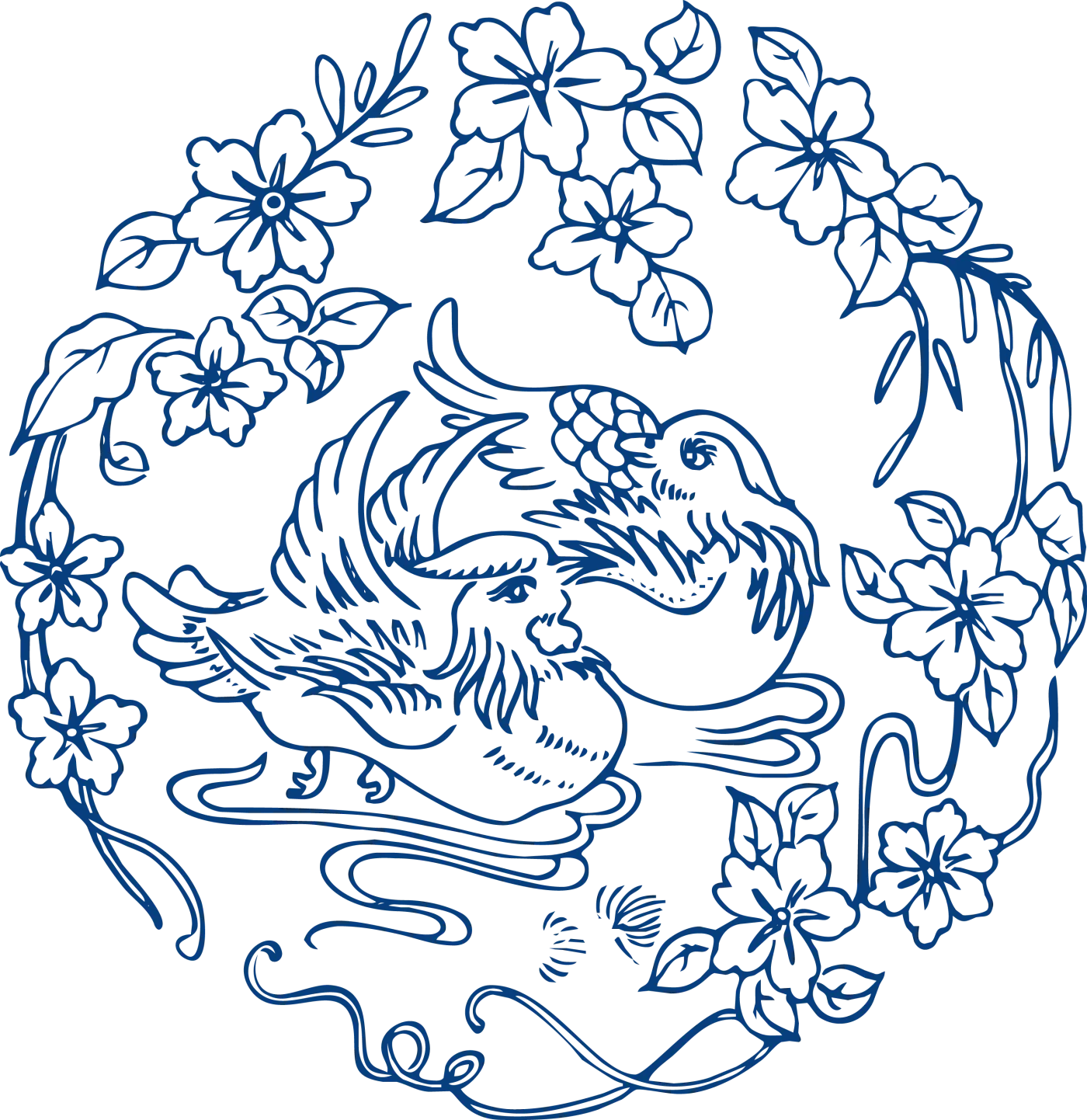
Modern bird-and-flower composition: the bird's direction and the flowering branches compete for attention. East Moment media archive.
The strongest animal or flower design does not merely identify a subject. It gives the eye a route through the object.
Blue and white went global because it could absorb new worlds
Blue-and-white porcelain is one of history's clearest arguments against the fantasy of sealed national style.
Cobalt materials, ceramic knowledge, vessel forms, merchants and customer demands moved through long-distance networks. Chinese workshops developed extraordinary technical and visual control, then used that control to answer domestic, imperial and overseas markets. Foreign clients did not only buy whatever China happened to make. They requested shapes, sizes, coats of arms and decorative subjects suited to their own lives.
The late-16th-century Met kendi makes the global story visible in its body. A kendi is a pouring or drinking vessel form associated with South and Southeast Asian use. This example was made in China at Jingdezhen and decorated with flowers and fruits in underglaze cobalt.
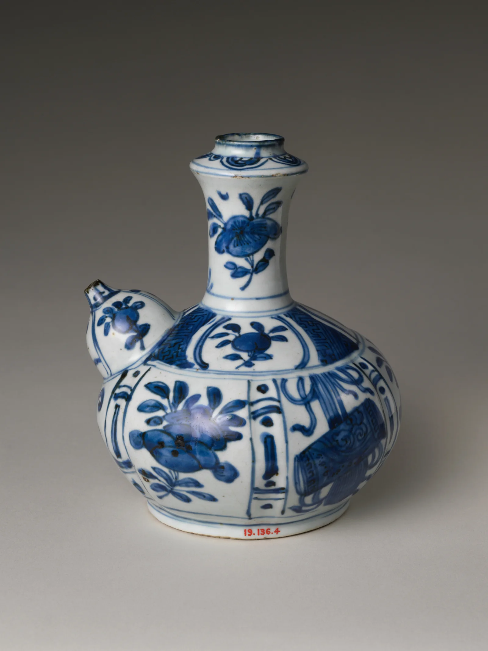
Pouring Vessel (Kendi) with Flowers and Fruits, late 16th century, Wanli period, Jingdezhen ware. The Metropolitan Museum of Art, public domain.
That object is Chinese, but its shape records a customer world beyond China. It is not culturally confused. It is commercially intelligent and visually hybrid.
Chinese blue-and-white porcelain then inspired ceramic production across Asia, the Middle East and Europe. Makers copied Chinese forms, misunderstood motifs, invented new bodies, developed local technologies and fed altered designs back into global taste. Delftware is not simply Chinese porcelain with a Dutch address. Japanese blue-and-white is not a footnote. Ottoman and Persian blue-and-white traditions are not failed copies. Each region translated the visual idea through its own materials, markets and aesthetics.
The global success came from adaptability. Two colors could carry a Chinese dragon, an Islamic-influenced vessel form, a European coat of arms, a Southeast Asian order or a domestic flower scroll without losing the basic identity of the system.
Blue and white became powerful because it could travel without becoming empty.
How to look at a piece without pretending to authenticate it
Enjoying the painting and dating the object are separate tasks. A confident brush can belong to a modern maker; an old piece can have rushed decoration. I will not let the promise of age do the looking for me.
You cannot authenticate blue-and-white porcelain from one photograph, one reign mark or one shade of cobalt. A genuine historical judgment compares form, body, glaze, foot, brushwork, pigment behavior, firing evidence, wear, restoration, provenance and securely dated examples. Specialists can still disagree. For the specific question of how a base mark fits that chain, use the Chinese ceramic marks guide.
Use this sequence instead:
- Read the silhouette first. Notice the relationship between neck, shoulder, body and foot. Does the decoration respect those zones?
- Follow the brush. Hand-painted lines vary in pressure, speed and pigment load. Variation does not automatically mean old, and repetition does not automatically mean fake.
- Find the glaze boundary. Look at the rim, foot and underside. Glaze thickness, pooling and exposed body can reveal production choices.
- Turn the object. Check whether the composition continues, repeats in panels or creates several focal points.
- Treat the mark as one clue. Reign marks were copied in later periods, used in admiration and forged for profit.
- Ask for provenance. A dramatic family story without documents is still a story.
- Separate age from quality. A modern studio piece can be excellent. An old commercial piece can be ordinary. “Old” is not a synonym for “great.”
This last point matters most. Fake expertise chases age because age sounds valuable. Real looking starts with material and design.
If you are buying, purchase from a seller who states whether an object is modern, antique, reproduction or “in the style of” a period. Demand condition information and a return policy. For serious money, use a qualified specialist rather than an image-search match.
Modern blue-and-white design is not trapped on a vase
Blue and white remains alive because the system can leave the museum without losing its logic.
Designers use it in fashion, packaging, interiors, tattoos, posters, digital illustration, product surfaces and brand identities. The strongest contemporary work does more than paste a dragon onto a hoodie. It understands how the original system controls density, repetition, framing, curvature and negative space.
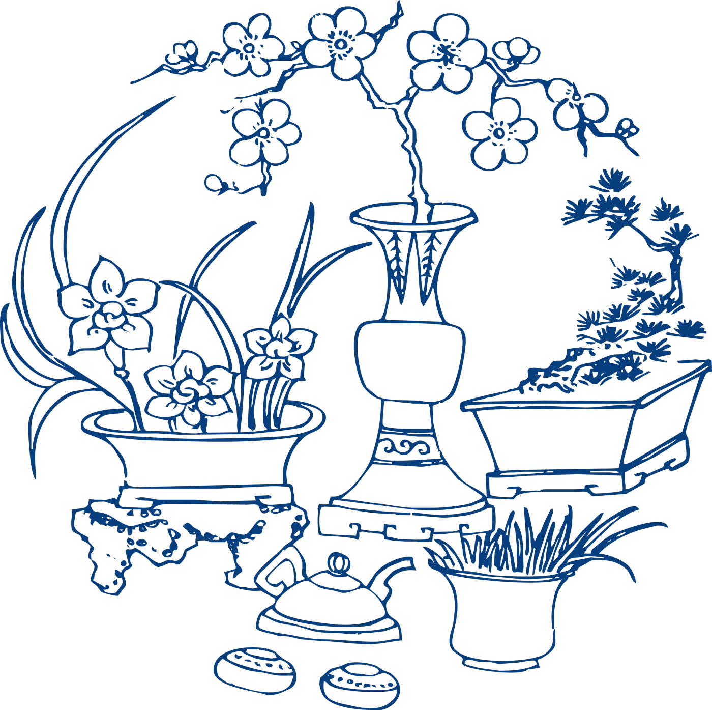
A modern archive composition gathers display objects, flowers and vessels into a dense circular field. It shows how blue-and-white visual language can move into illustration and surface design. East Moment media archive.

Modern pavilion, fish and flower study: different subjects share one field, so their relative scale becomes crucial. East Moment media archive.
The weak modern version treats “Chinese style” as a folder of motifs. Add clouds, a dragon, peonies and a geometric border until the surface looks culturally busy.
The strong version makes a decision. It chooses one focal point, builds hierarchy, gives the image breathing room and lets the format control the composition. It understands that the border is structure, not filler. It knows that white is a color with a job.
This is where blue-and-white porcelain becomes genuinely useful to young designers. The lesson is not “copy old China.” The lesson is “build a strict visual system, then make it flexible enough to carry new content.”
That is exactly what the best historical workshops did.
Why blue-and-white porcelain still wins
Blue-and-white porcelain survives because it performs several contradictions at once.
It is limited to two dominant colors but can hold enormous visual variety. It can look luxurious or everyday. It can carry court symbolism, export orders, domestic flowers, comic animals or quiet geometric rhythm. It is made from earth and minerals but can feel lighter than paper. It depends on disciplined production yet preserves the speed of a human brush.
Most importantly, it does not ask you to admire it only because it is old.
Turn a strong piece and the design keeps changing. Move closer and a confident contour breaks into pigment grains, soft bleeding and tiny pressure changes. Step back and those local decisions gather into one silhouette. The close detail has to earn its place in that larger view.
That is my final judgment: Chinese blue-and-white porcelain is not merely a decorative category inside Chinese ceramics. It is one of the world's most successful design systems. Jingdezhen and other makers proved that craft becomes globally powerful when material science, production intelligence and visual imagination stop acting like separate departments.
Two colors were enough. The thinking behind them was never simple.
Bring a pale passage from one object into Moments. Point to the wash or untouched interval you would defend against another stroke of dark blue. Then return with the whole vessel and test whether your favorite detail still matters at a distance. Chinese blue and white porcelain deserves that kind of attention: close enough to see the decision, far enough away to judge whether it worked.