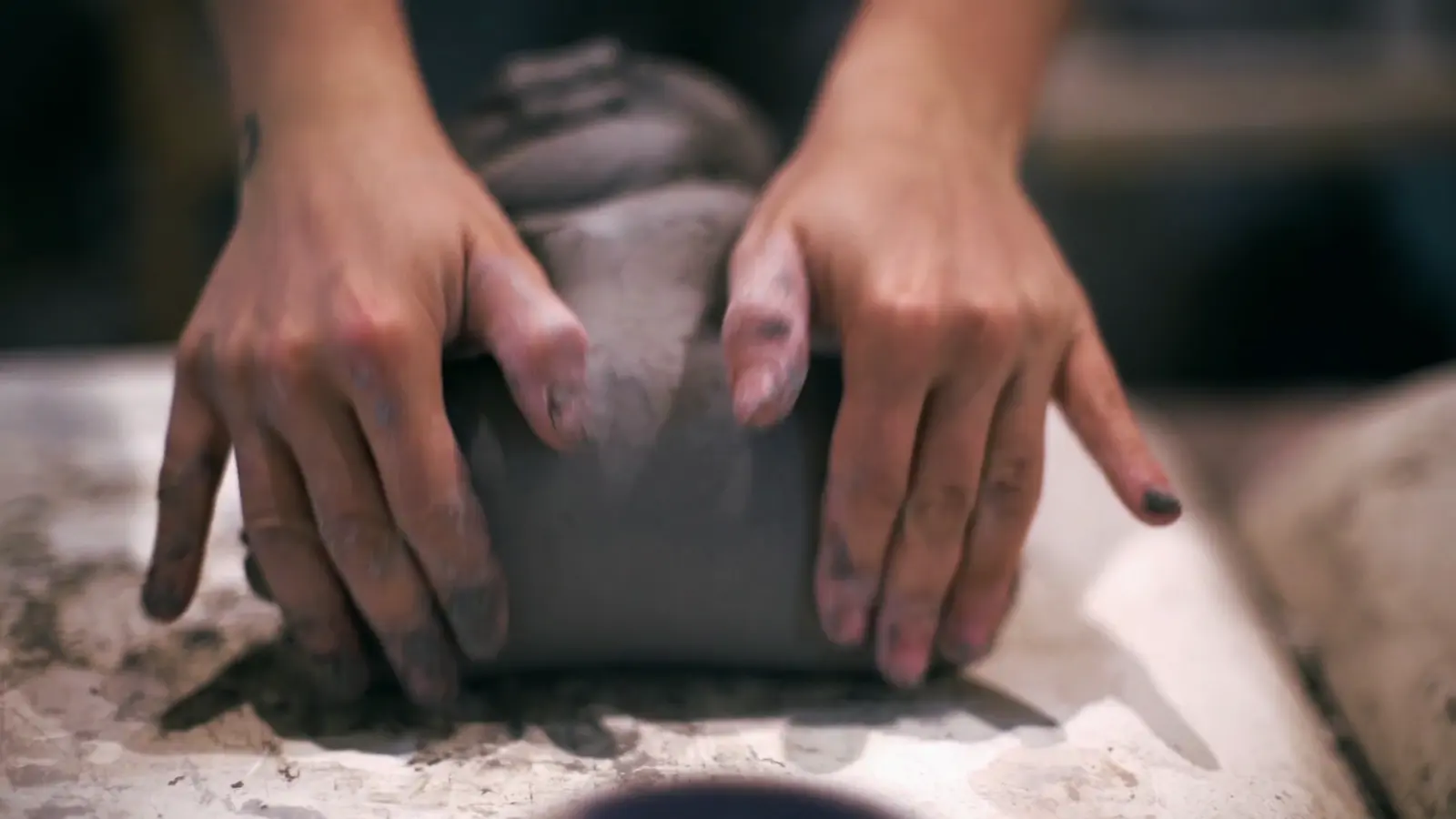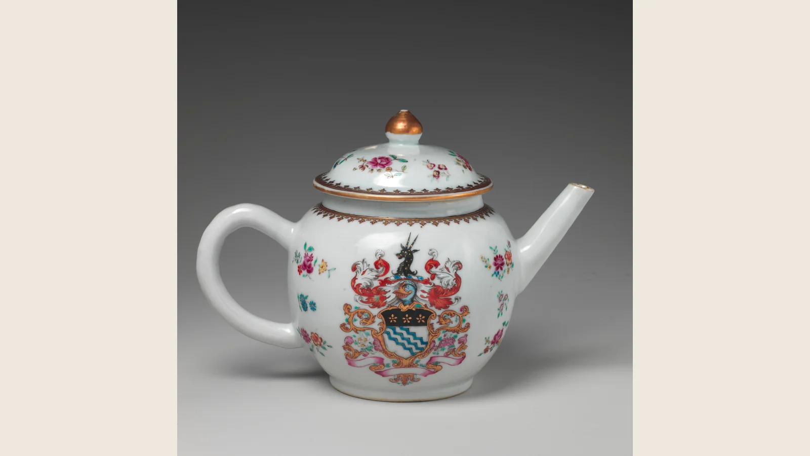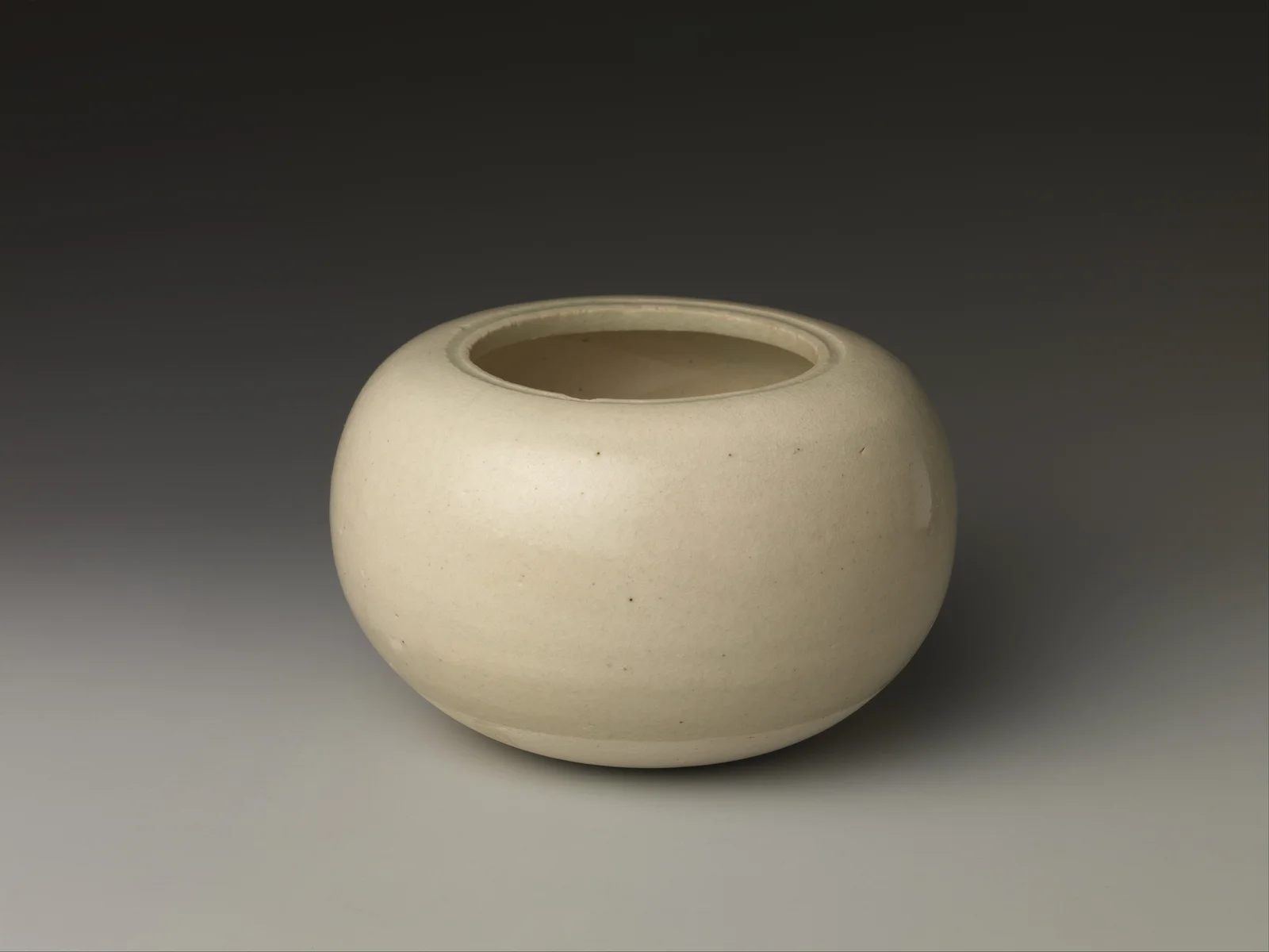
Chinese ceramic glazes are glassy coatings fused to clay bodies by firing. The glaze can carry color itself, cover painted decoration or sit beneath later-fired enamels. Those are different constructions, even when a phone makes them look equally blue. I care more about that distinction than a grand color name: it explains what the maker did and gives your eye something specific to follow.
Chinese ceramic glazes make light part of the object
I think a glaze becomes interesting at the moment it refuses to behave like a flat color chip. It can deepen in a recess, thin at a rim, hide a carved line until light finds it, or make a white body feel calm rather than blank. That movement is why two photographs of the same vessel can feel surprisingly different.
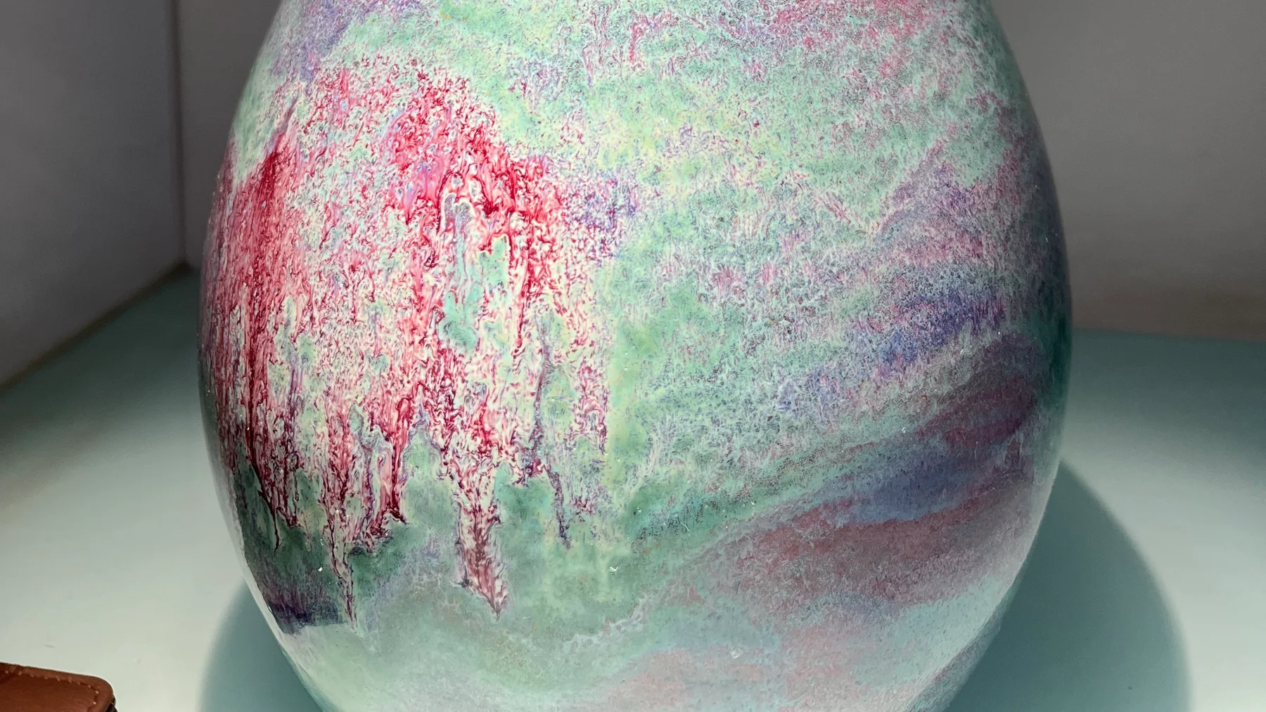
In the opening photograph from the Jun Ceramic Culture Park, a rounded vessel carries pale green-blue areas, pink-red patches and a dense, fine surface variation. The darker vertical red passages do not behave like outlined flowers. They meet and dissolve into paler surroundings. Calling the whole thing “green” discards the very part that makes me want to keep looking.
This is a contemporary display, not a photograph of a Song-dynasty celadon bowl. Its value here is immediate and visible: several color regions occupy one continuous curved surface. We can study their edges without pretending to recover a kiln recipe from the picture.
Body, glaze, pigment and enamel are different layers
The body is the fired clay structure. The glaze is the fused coating. An underglaze pigment supplies decoration beneath that coating; an overglaze enamel supplies fired color above it. A surface can combine these. “Painted porcelain” alone does not tell you which sequence was used.
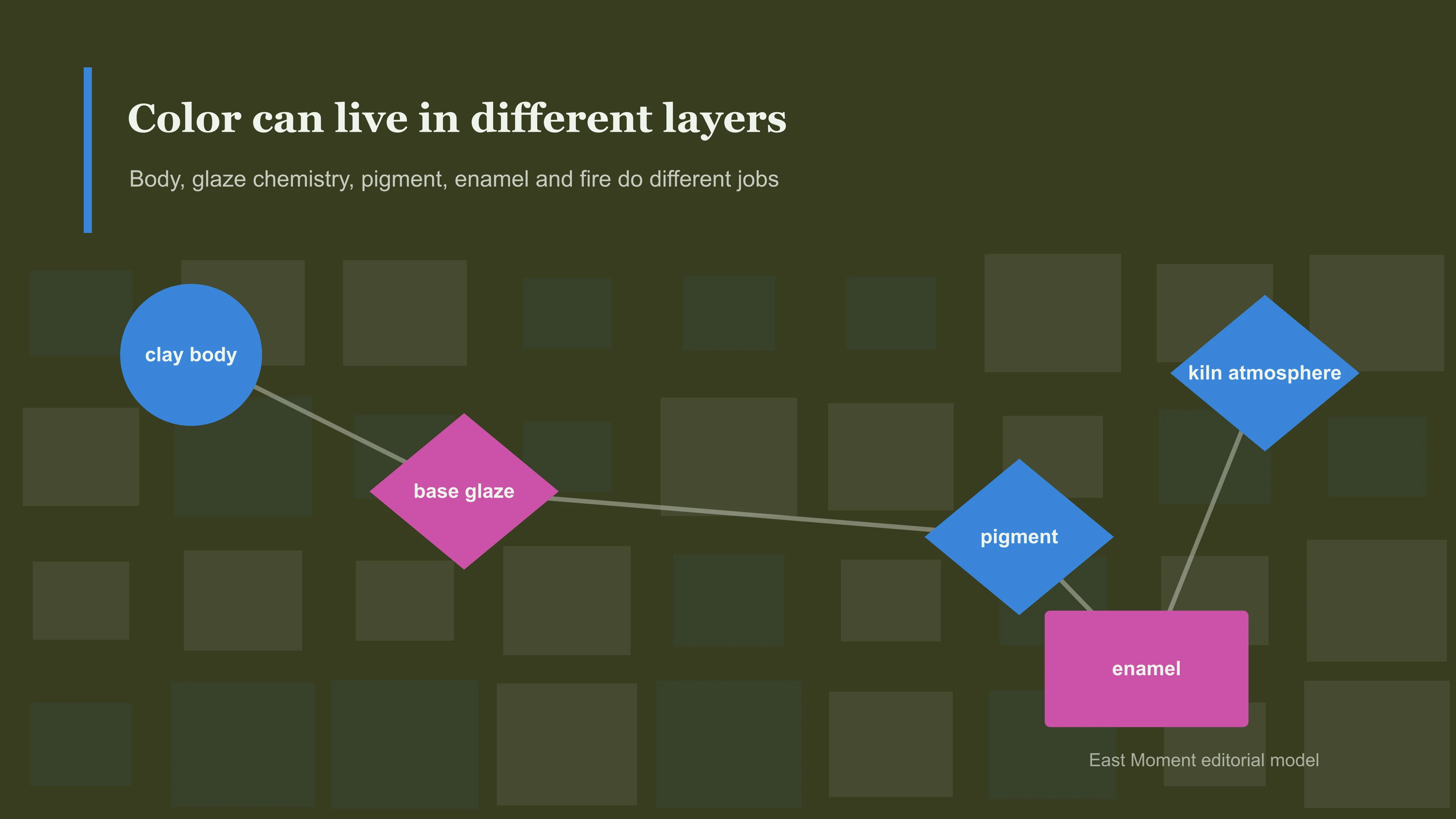
Glendale Community College's glaze teaching notes describe the roles of glass-forming materials, fluxes and stabilizing ingredients. Silica is a principal glass former; fluxes help the mixture melt at a usable temperature; alumina influences its stability and flow. The balance matters more than treating any one ingredient as the secret of Chinese color.
Firing conditions matter too. The Canadian Conservation Institute's ceramics guide explains that oxygen conditions affect coloring oxides and distinguishes decoration under and over glaze. This is why “the potter painted it blue” is often an incomplete account. Application, heat and atmosphere work together; color after firing need not resemble the unfired coating.
There is a practical payoff to this vocabulary. If a seller shows a blue flower beneath a continuous glossy surface, ask about underglaze decoration. If a museum describes polychrome enamels, do not silently rename them multicolored glaze. If the surface flows without a drawn outline, start by describing the color transitions. How Chinese porcelain is made follows the workshop sequence; this page stays with what those layers let us see.
Four visual languages worth separating
| Surface language | What to notice | Do not assume |
|---|---|---|
| Celadon | Green depth, pooling, carved or moulded relief | That every green glaze is Longquan or a particular age |
| Pale/white glaze | Rim, foot, carved depth, light across the body | That restrained color means simple technology |
| Blue-and-white | Brush pressure, cobalt variation, transparent glaze over blue | That blue is a glaze or that every blue-and-white piece is Ming |
| Enamel color | How colors sit across a turning surface and organize zones | That more color means less discipline |
The Met’s Chinese ceramics overview is useful because it keeps material, kiln history and object type together. That is the discipline I want here too: color is evidence of a surface, not a password to a dynasty.
Read a glazed surface before you name it
When I meet an unfamiliar ceramic, I give myself a short looking sequence before reaching for a label. I turn it slowly or move my viewpoint instead of fixing my eyes on the loudest color. First comes the rim: does the surface look thinner, darker or more translucent there? Then the curve: does light travel cleanly, gather in a recess or break against carved relief? Finally the foot: where does the glaze stop, and what relationship does that stopping point have with the body and the vessel's practical shape?
This is not a collector's trick. It is a way of returning the object to three dimensions. Screens encourage us to call a bowl “green” or a vase “blue-and-white” as if the name finished the seeing. In person, a good glaze resists that shortcut. It may look cool at one angle and warm at another, almost opaque over one line and transparent over the next. The object asks the viewer to move, which is why one careful museum photograph can be a beginning but never the whole encounter.
The useful notes are concrete: where the color pools, where it thins, whether brushwork follows a curve, whether a carved design only appears in oblique light. These observations travel well. They help a reader compare a documented museum object with another image without pretending that visual resemblance is proof of origin.
Celadon: green that changes with depth
Celadon belongs to the iron-glaze story, not to a recipe made from jade. The Museum of Oriental Ceramics, Osaka explains that iron-bearing glazes can produce blue-green, yellow, brown or black effects depending on the mixture and firing conditions. One coloring element does not guarantee one color. Nor does a green appearance establish a particular kiln.
Celadon is often described as jade-like. The comparison can be helpful, but I do not let it erase the ceramic. Jade does not pool at a carved line or turn translucent at a thin edge in the same way. A celadon glaze makes the vessel’s topography visible.
The right question is not “is this the correct celadon green?” Look instead at how the surface changes on rim, body and recess. Is the visual effect carried by a carved design, the thickness of glaze, or the relationship between the object and light? Those observations are real; they do not authenticate an unknown object.
Dark does not mean featureless: follow the shoulder to the foot

The pale flecks cluster over the upper body, while the lower curve becomes quieter and meets a blue-green foot. The bright spot near the lower centre is a reflection; it should not become a white painted motif in our description. Follow the transition downwards and the vessel has a clear visual rhythm: activity, pause, support.
I prefer that rhythm to the loose word “metallic.” A photograph can make a ceramic look like metal without establishing what creates the sheen. Here the dark ground makes the light areas feel suspended rather than printed as a repeat. The effect is powerful precisely because the lower body gives the eye somewhere to rest.
Pale ware poses the opposite viewing problem: low contrast can hide relief, thin glaze and subtle edges. Neither quiet white nor dramatic darkness wins automatically. The Five Great Kilns guide gives historical traditions their own context; they are not rungs on a ladder from colorful to refined.
Blue glaze is not the same thing as painted blue-and-white

The blue-purple vessel has a warm vertical ridge running through a much cooler field. Fine pale speckling crosses the rounded surface; a bright horizontal reflection cuts across its lower part. Nothing in this view resembles the deliberate outline of a painted lotus or a brush-written character. The ridge and the surrounding glaze do the visual work.
In blue-and-white porcelain, cobalt decoration is painted beneath a transparent glaze. That technique is a different starting point from this continuous blue-purple surface. You can ask where a brushstroke begins and ends on a painted bowl. Here I ask how the ridge divides the body and why the adjacent fields appear cooler. Both questions are concrete, but they are not interchangeable.
Our blue-and-white porcelain guide follows brushwork and the firing sequence in depth. If the problem is identifying a scroll or border rather than its material layer, continue to porcelain patterns. “Blue” alone will not choose the right guide for you.
The gourd group makes color negotiate a waist

Look first at the pale lower belly of the large form, then the purple necks of the smaller surrounding gourds. A narrow neck, a pinched waist and an expanding belly give a glaze very different shapes to cover. Color changes make those transitions more pronounced. The small forms are not simply miniature repetitions of the large one's surface.
This is where I find kiln-variable surfaces most convincing: related objects belong together without becoming identical. Yet a group photograph does not tell us whether the pieces shared a recipe, kiln position or firing. We can compare the results without filling those gaps with a romantic story about chance.
I reject the idea that colorful ceramics are automatically excessive while pale ones are automatically pure. A concentrated purple neck can make a swollen pale body easier to read. Equally, a spectacular glaze can overwhelm a weak shape. My test is blunt: does the color help you understand the vessel, or does it distract you from looking at it?
Make two photographs that disagree usefully
You do not need an antique to try this. Choose an ordinary ceramic you can handle safely and leave it on a steady surface. For the first image, use soft, diffuse light: the aim is an even view of the color fields, not a dramatic product shot. For the second, bring light from one side or change your viewing angle so relief and gloss become easier to see. Do not lift a delicate object by its handle or move a museum display.
Keep the background and framing similar. Turn off beautifying filters. If the camera allows it, keep white balance fixed; otherwise note that automatic adjustments may change the apparent color. Two images made under different lighting are not laboratory measurements. They are a way of asking which details stay with the object and which travel with the light.
Point to one feature in both views. Does a pale stripe move or vanish? It may be glare. Does a line remain in the same place but acquire a shadow? Surface relief becomes a better question. Does a colored region stay put while losing its glow? You have separated its location from the photograph's dramatic effect. None of these is a chemical test; each improves the description.
For a useful note, write “the pale band disappears in the diffuse view,” not “this glaze is magical.” I enjoy the surprise as much as anyone. But describing the surprise gives someone else a way to check it, and that is what turns a beautiful photograph into a conversation.
A glaze is not an identification tool by itself
People often hope a crackle, blue tone, green surface or purple flash will answer “how old is this?” It cannot. Lighting, photography, restoration, reproduction, wear and later revival can all distort a first impression. A responsible judgment requires the whole object: form, body, glaze, foot, decoration, firing traces, condition, provenance and securely documented comparisons.
That is why the Chinese ceramic marks guide begins with the warning that a base mark is a clue, not a certificate. The same is true of surface. A quick name can begin research; it should never replace it.
Crackle is stress made visible, not a clock
Crackle invites overconfidence because it looks like time drawn directly on the object. The network can be broad, tight, darkened, layered or barely visible until light reaches it sideways. That beauty is real. The shortcut is false.
At the material level, crackle appears when body and glaze do not contract in exactly the same way as the fired object cools and later responds to its environment. In some traditions makers accepted or deliberately cultivated the effect; in others it is a defect. Some cracks can continue to develop after firing. Liquids, dirt and later handling may enter the network and change its contrast. None of those facts allows a photograph to announce an age.
I am impatient with listings that turn every crackled surface into "centuries of history." A controlled modern glaze can craze. An old object can have a comparatively quiet surface. A dark line may record use, staining or later treatment rather than a dramatic birth in an ancient kiln. The responsible eye asks whether the crackle belongs coherently with glaze thickness, body, foot, form, wear and documented comparison.
The useful way to photograph crackle is therefore not one heroic close-up. Make a small evidence sequence: whole object, raking side light, rim or foot where glaze meets body, and any area where the network changes density. The pattern becomes meaningful when it returns to the vessel. Detached from form, it is just a beautiful web waiting for a seller to invent a story.
Why a repair can change the way color reads
Repair, cleaning and age can alter the visual story. A filled chip may interrupt a line of glaze; a restored area may catch light differently; dirt or old adhesive can make a foot look more dramatic than it is. I do not treat these as embarrassing interruptions to hide from a photograph. They are part of the object that has survived.
When studying an unknown piece, photograph repaired areas in the same calm light as the rest of the surface. A visible repair does not erase historical interest, but it changes the questions worth asking. The honest pleasure of ceramics is not a hunt for flawless certainty. It is learning to see an object's making, use and later life in the same glance.
My verdict: let color slow the claim down
Chinese ceramic glazes become memorable when color stops being a label and becomes an event: green deepening in a groove, a pale glaze revealing relief, cobalt adapting to a curve, enamel organizing a whole body. Let that visual event arrive before the dynasty label.
Continue to the Chinese art hub and Chinese ceramics for the larger material map, or bring one surface you cannot stop looking at to East Moment's community. Photograph it whole, then in side light, and describe what light is doing before naming a dynasty. Return when other readers add their own surfaces: the comparison may confirm your first judgment, and it may expose how easily one dramatic photograph fooled you.