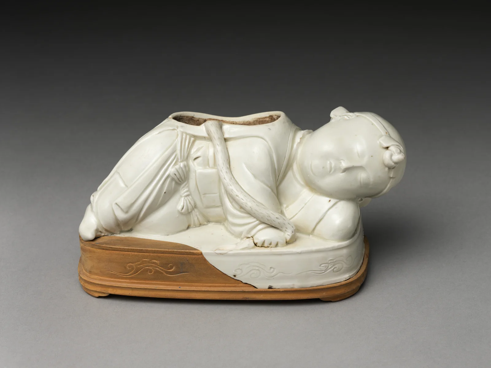
The little boy in the opening photograph is my objection to the usual Five Great Kilns of China introduction. He is a Ding ware pillow base, with a bent arm, carefully drawn clothing and a face worth pausing over—not another anonymous pale bowl. Learn Ru, Guan, Ge, Ding and Jun, certainly. But do not let five prestigious names make the objects less human.
What are the Five Great Kilns of China?
The Five Great Kilns are Ru, Guan, Ge, Ding and Jun. In Chinese, the familiar phrase is Songdai wu da mingyao (宋代五大名窑), the Five Great Kilns of the Song period.
The phrase is useful, but it needs a warning label. It is not a known official league table issued by the Song court. It is a later canonical framework shaped by collecting, connoisseurship, scholarship and museum culture. Nor were all five operated in the same way or equally connected to imperial demand. Calling every one of them an “imperial kiln” turns a complicated ceramic world into a false brand family.
What makes the group worth keeping is not that it settles history. It creates a sharp comparison. Put these wares beside one another and the Song ceramic field stops looking like a row of pale bowls. You begin to see different production systems, different surfaces and different ideas of perfection.
I keep the famous five only because comparison can wake up the eye. I reject the version that turns them into a ceramic aristocracy and asks a beginner to admire status before material. If the list cannot help us notice a rim, a carved line, a dark body or a pool of glaze, the prestige has become dead weight.
The opening object is the Met's eleventh–twelfth-century Ding pillow base. Its catalogue identifies a base, not a complete pillow; the missing upper part matters. Even with that loss, the reclining figure shows how much expression ivory porcelain could carry. I would start a first visit here rather than asking someone to admire rarity before they have found anything to enjoy.
Choose the question that interests you first
| Ware | Core visual language | Production and court relationship | The question it teaches you to ask |
|---|---|---|---|
| Ru | Soft blue-green glaze, restrained forms, subtle crackle | Short-lived Northern Song production closely associated with court patronage | How much visual intensity can exist inside restraint? |
| Guan | Thick celadon glaze, dark body, layered crackle | “Official ware” linked to Southern Song court production after the move south | Can a cracked surface become part of an object’s structure? |
| Ge | Prominent crackle networks, often with darker and lighter lines | Historical identity and kiln location remain disputed | What happens when a collecting category becomes firmer than the archaeology? |
| Ding | Ivory-white porcelain, carved, incised, impressed or molded decoration | Large northern commercial system that also served elite and court users | Can repetition and scale still produce graphic elegance? |
| Jun | Opalescent blue glaze, sometimes purple or red splashes | Diverse production associated with Henan; dating of some court-linked flower vessels is debated | Is color something applied, or something grown inside a glaze? |
This table is a map, not an authentication key. Each name covers variation, later revival and difficult attribution. One photograph cannot reveal every technical or historical difference.
Song ceramics were not trying to become one style
The Song period, conventionally dated 960–1279, supported extraordinary ceramic diversity. Regional kilns worked with different clays, fuel, kiln structures, markets and inherited skills. Court taste mattered, but so did monasteries, tea culture, urban consumption, burial practice, regional trade and the daily need for durable vessels.
The Metropolitan Museum of Art’s Chinese ceramics overview is valuable because it keeps court patronage beside regional production rather than pretending one palace invented the entire field.
The five-kiln framework can accidentally make Song ceramics look exclusively quiet, elite and monochrome. They were not. Cizhou workshops produced bold painted and carved decoration. Jian kilns fired dark tea bowls alive with iron-rich streaks and crystals. Longquan celadon moved across domestic and maritime networks. Everyday storage, cooking and table wares vastly outnumbered the objects now isolated in museum cases.
So why focus on these five? Because they are exceptionally good at training the eye. Their effects often depend on small differences in glaze depth, rim treatment, firing atmosphere, foot finishing and the tension between surface and form. They reward slow looking in an image culture designed for the swipe.
That slowness is what I want from this page. I do not want readers to leave with five color labels and the anxiety of an exam. I want them to discover which kind of ceramic intelligence moves them: restraint, fracture, uncertainty, graphic order or fired color. Preference is not the enemy of scholarship. It is often the reason a person looks long enough to learn.
Ru ware makes quiet feel engineered
Ru ware is famous for rarity, but rarity is the least transferable way to understand it. You cannot see a survival statistic across a gallery. You can see the way a soft blue-green glaze settles over a controlled form, the way a rim stays calm, and the way tiny firing supports leave discreet marks beneath some pieces.
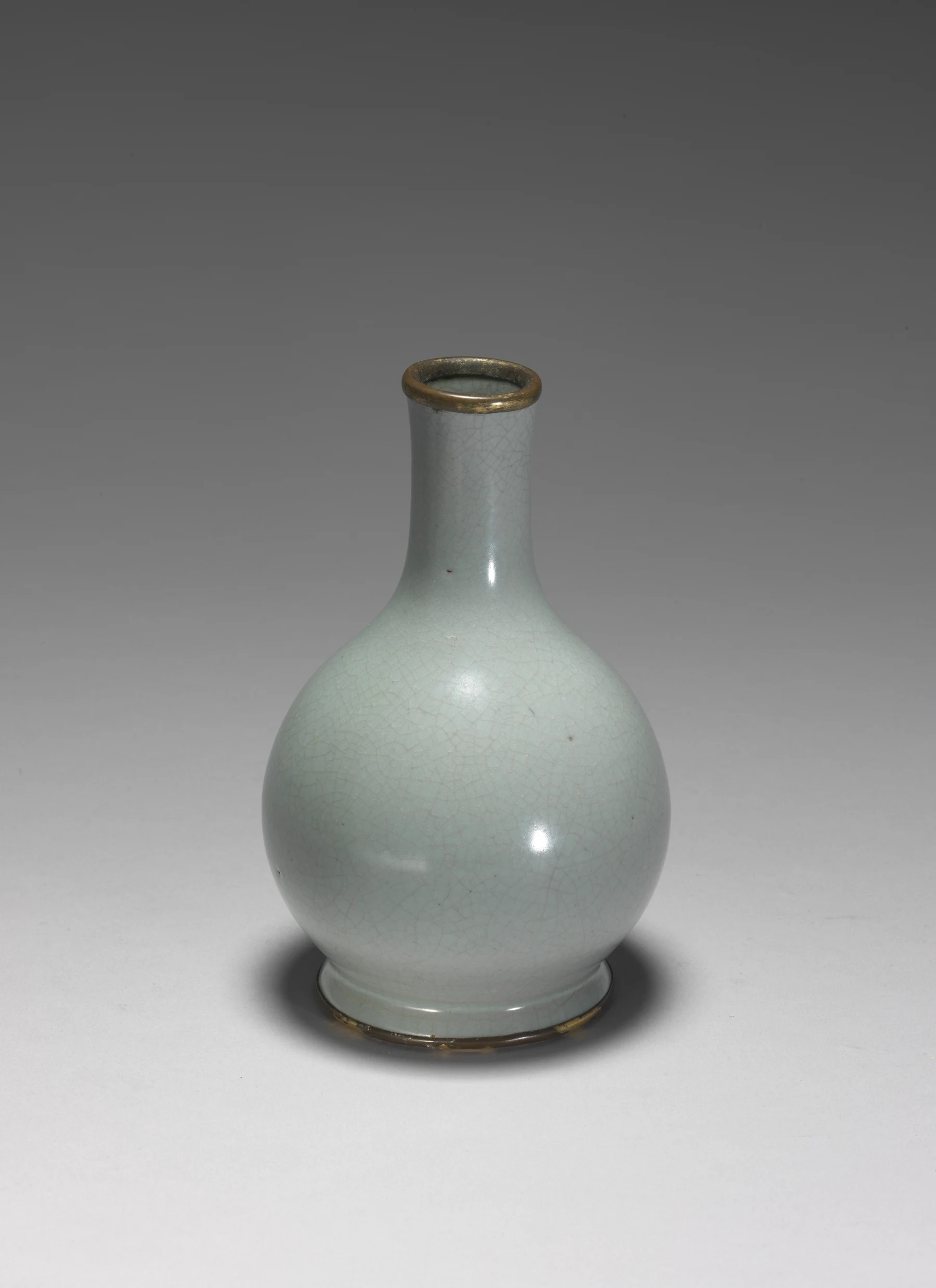
Northern Song Ru ware gallbladder-shaped vase, National Palace Museum. The profile makes restraint measurable: a long neck, low shoulder and almost no decorative interruption.
The strongest Ru objects feel edited. Nothing is trying to win the frame alone. Glaze, profile and proportion operate at the same volume. That balance explains why a seemingly simple dish can hold attention longer than a more decorated object.
The complete Ru ware guide follows the archaeological context, glaze character, close-looking clues and the limits of visual attribution.
Guan ware turns fracture into atmosphere
Guan means “official,” and Guan ware is associated with production for the Southern Song court after the political center moved south to Hangzhou. Its most recognizable surfaces combine thick celadon glaze with crackle, sometimes visually intensified by darker lines.
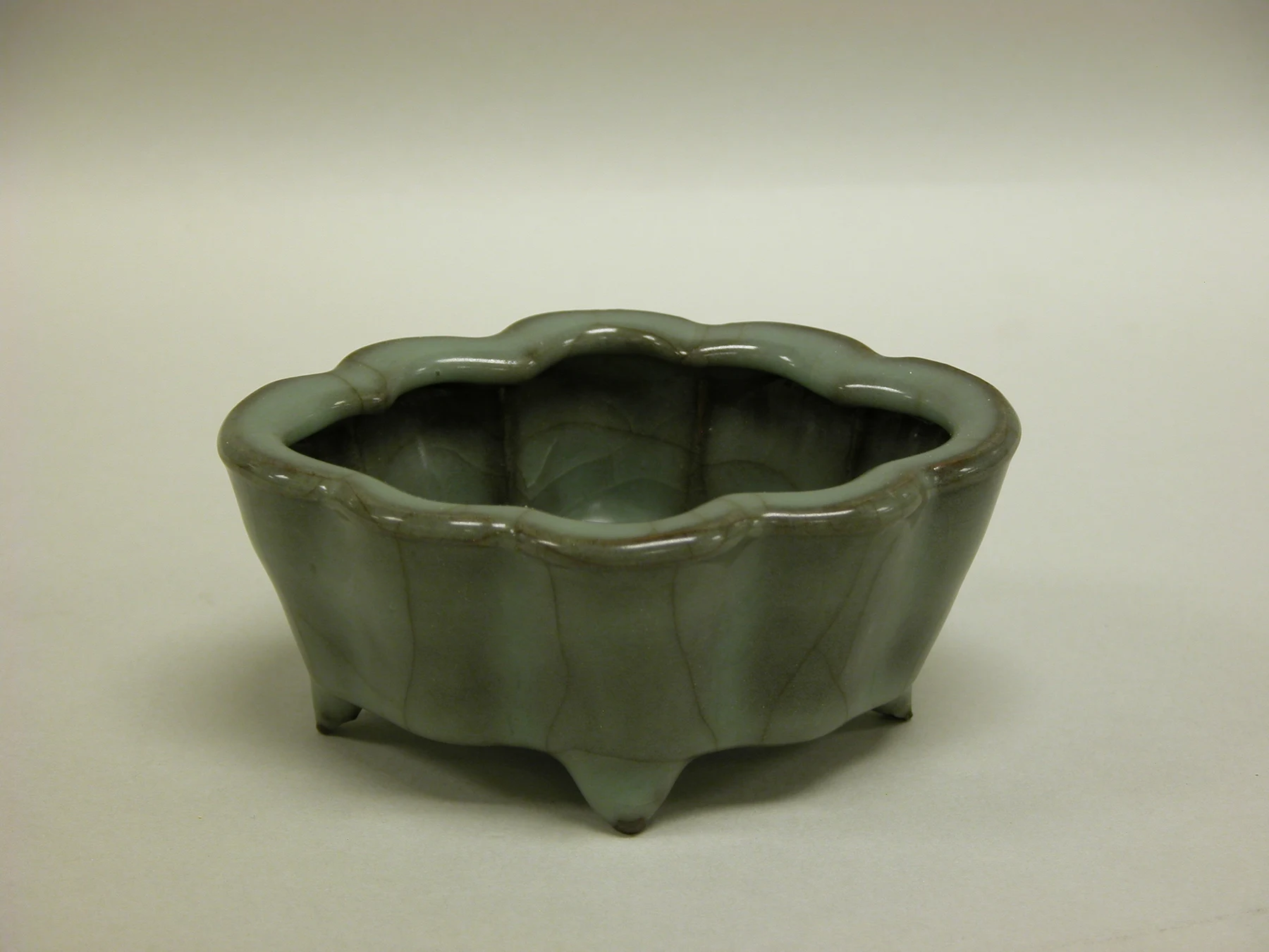
Foliated water receptacle, Jiaotanxia Guan ware, twelfth–thirteenth century. The Metropolitan Museum of Art, Open Access. Crackle is only half the experience; the lobed rim makes the thick glaze negotiate a changing contour.
Crackle is caused by tension between glaze and body as they cool and contract differently. That does not make every line predictable. Networks vary in scale, density and emphasis. Staining may enter cracks over time or be deliberately encouraged. The result can feel geological: not an illustration of stone, but a surface behaving under pressure.
The Guan ware guide explains why crackle belongs to a material system rather than a decorative filter pasted over a vase.
Ge ware refuses to give us a clean answer
Ge ware is the awkward member of the five, which is exactly why it matters. Historical texts, later collecting labels, surviving objects and archaeological evidence do not lock together neatly enough to give Ge ware one undisputed kiln site and stable identity.
Its celebrated crackled surfaces are real. The confidence with which any particular object can be called “classic Song Ge” is another question.
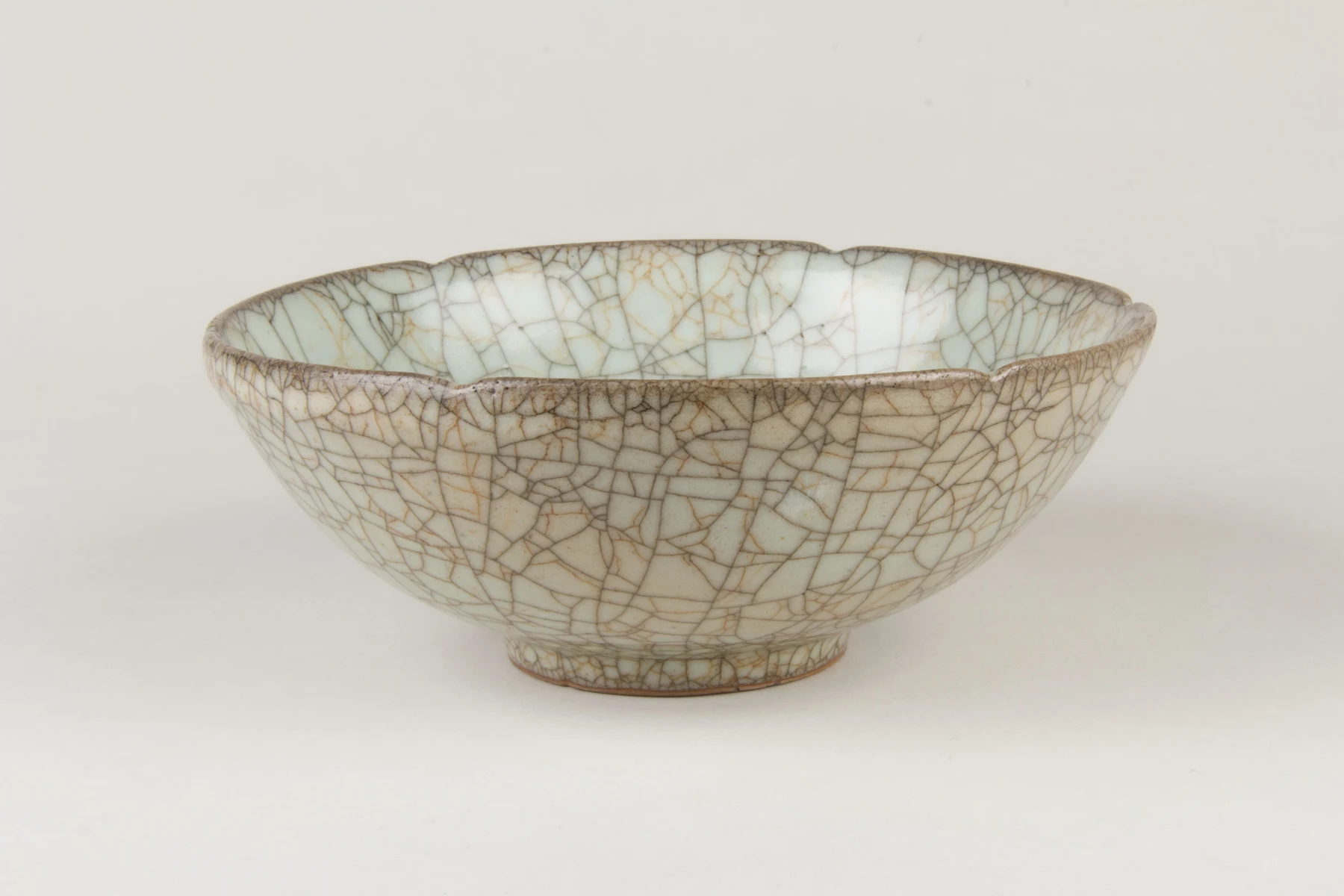
Bowl catalogued as Ge ware by The Metropolitan Museum of Art, Open Access. The plain title looks certain; the missing date in the record is exactly why the category must remain visible as a historical problem.
That uncertainty is not a failure in the story. It reveals how ceramic categories are built. Collectors compare surfaces, texts preserve names, museums inherit attributions, science examines bodies and glazes, and archaeology tests those traditions against excavated material. Sometimes the label survives more securely than the original production history.
The Ge ware guide keeps the beauty and the uncertainty in the same frame.
Ding ware proves white porcelain can be graphic
Ding ware came from a major northern kiln system centered in present-day Hebei. It is celebrated for fine white porcelain, often carrying an ivory-toned glaze and carved, incised, impressed or molded decoration.
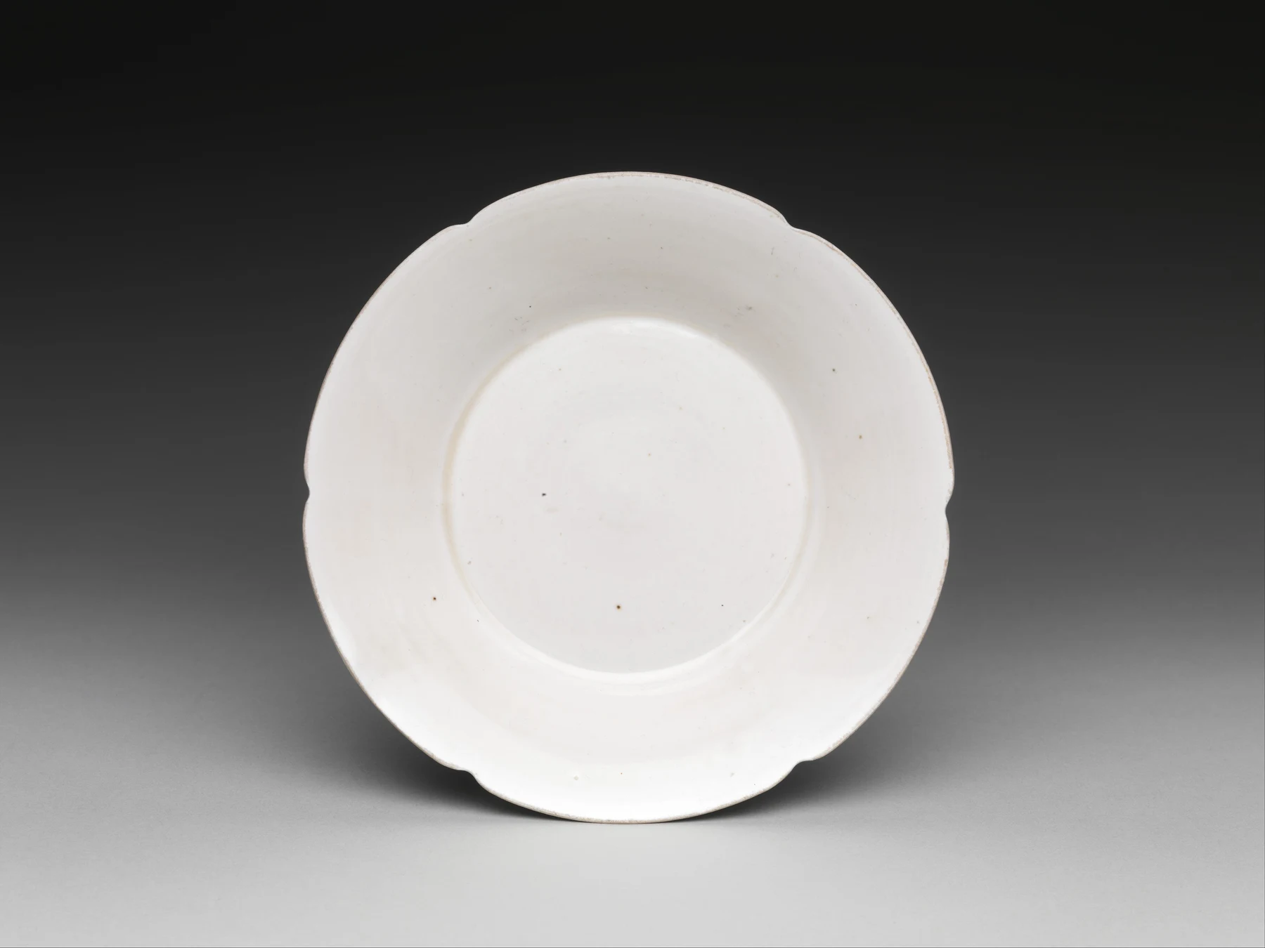
Ding ware dish with scalloped rim, eleventh century. The Metropolitan Museum of Art, Open Access. Its argument is shape and light, proving Ding does not need dense carving to make white porcelain active.
White does not mean blank. Decoration can sit just below the threshold of immediate visibility, appearing as light crosses the surface. A lotus petal or chrysanthemum scroll stretches with the curve of the dish. Mold technology allowed repeated designs and larger output, but repetition did not automatically erase design intelligence.
Some Ding vessels were fired upside down on their rims to increase kiln capacity, leaving an unglazed edge that could later receive a metal binding. That detail connects aesthetics directly to production economics. The Ding ware guide makes that system visible.
Jun ware lets chemistry improvise
Jun ware is recognized for thick, opalescent blue glazes that can shift through lavender, gray, turquoise and purple-red effects. Copper can contribute to dramatic splashes, but “blue pigment plus purple pigment” is the wrong mental model. Glaze thickness, phase separation, bubbles, light scattering, atmosphere and cooling all participate.
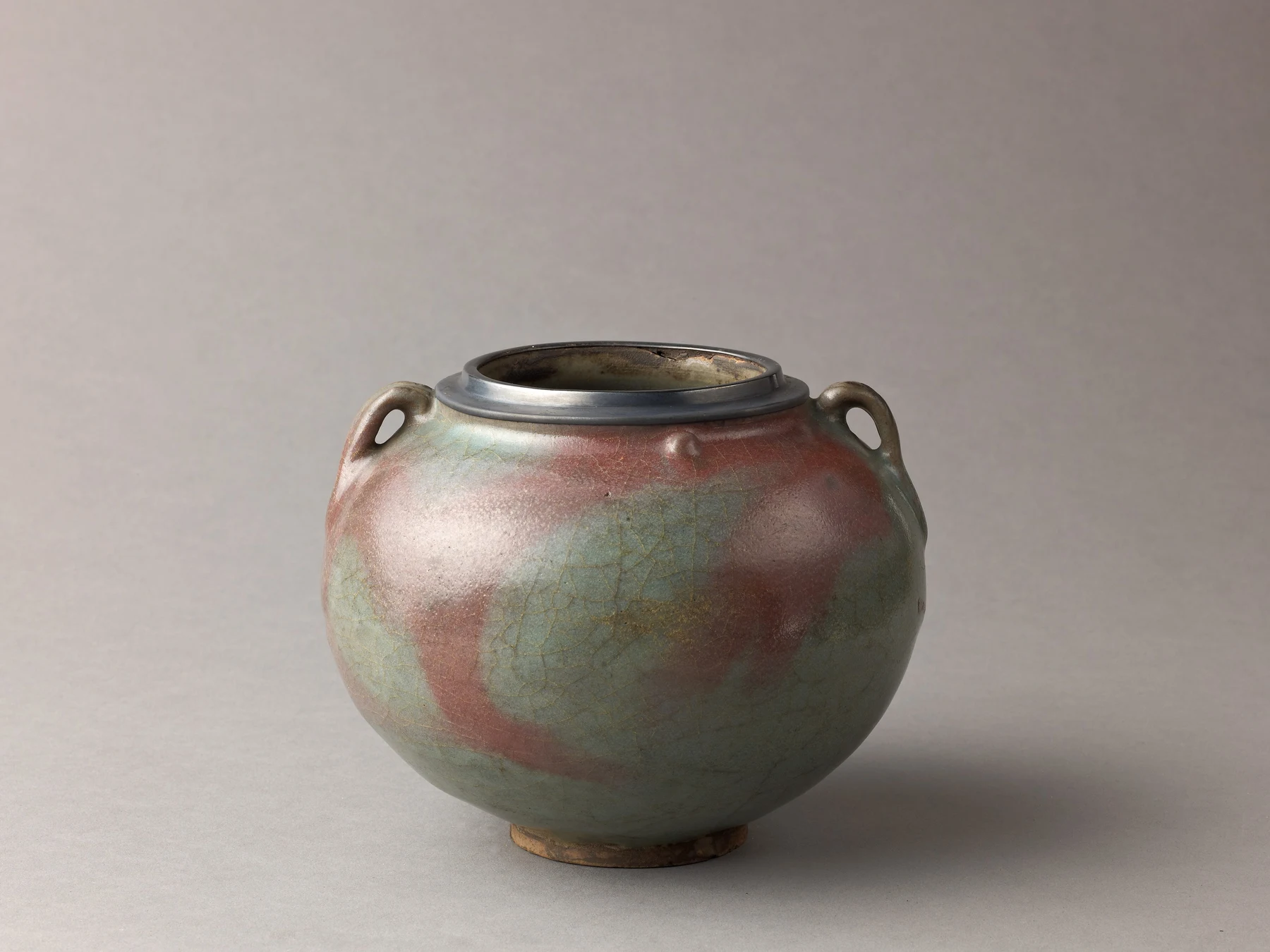
Two-eared Jun ware jar, about thirteenth century. The Metropolitan Museum of Art, Open Access. The flushed blue does not sit evenly on the vessel; it gathers, thins and changes with the body.
This is color with depth. The eye is not only reading a hue on top of clay; it is reading light moving through a glassy structure.
Jun also carries a major chronology problem. Large numbered flowerpots and stands traditionally linked to court use were long placed in the Northern Song, but archaeological and technical research has led many scholars to consider later dates for at least part of that group. The Jun ware guide separates well-established glaze knowledge from contested dating.
The real comparison is not color versus color
Online guides often reduce the five kilns to a palette: Ru is sky blue, Guan is gray-green, Ge is cream, Ding is white, Jun is blue-purple. Color helps, but it is unstable across lighting, photography, display screens, burial conditions, glaze thickness and later restoration.
A better comparison uses five layers:
- Form: Is the profile spare, molded, carved, heavy, thin or deliberately archaic?
- Body: What can the foot or exposed edge reveal about clay color and density?
- Glaze: Is it thin, thick, opaque, translucent, pooled, crackled or opalescent?
- Firing evidence: How was the object supported, and where was glaze removed?
- Production context: Was this a narrow court-linked output, a large commercial system, a later revival or an uncertain attribution?
That sequence keeps you from treating a color chart as connoisseurship.
Bad photographs do not merely look ugly; they teach the wrong lesson
The most dangerous five-kiln comparison is a grid assembled from random auction thumbnails. One image is warm, another has a blue cast, one has been sharpened until every crack becomes black and another has lost its ivory relief to overexposure. The viewer thinks they are comparing ceramics. They are actually comparing cameras, lighting and post-processing.
This is why I will not tell you that Ru is one hex code and Guan another. A responsible comparison uses securely identified objects, keeps dates and catalogue language attached, and asks what remains visible even when color shifts: profile, relief, glaze thickness, crackle scale, rim and foot. Color is still evidence. It simply cannot carry the whole verdict.
That is what frustrates me about a beautiful phrase beside a muddy photograph. “Rain-washed sky” gives the reader an expectation; a recolored thumbnail then supplies the wrong evidence. Prefer an honest, slightly less dramatic image with a readable rim to a saturated close-up that hides the object. Here the selected photographs retain distinct vessels and catalogue identities. They are not samples of five guaranteed colors.
“Official,” “court used” and “famous” are different claims
This is the distinction most English introductions flatten.
Guan literally names official ware. Ru production is closely associated with Northern Song court taste and patronage. Ding was not simply a palace workshop; it was a major kiln system whose products circulated broadly, although fine Ding wares were also used by elite and court consumers. Ge remains historically unstable. Jun includes multiple production questions, and the date and status of some large flower vessels remain debated.
These are not minor footnotes. They change how we understand labor and power. A court can shape taste without physically making an object. A commercial kiln can deliver extraordinary refinement. A later collector can elevate one category while the names of individual makers disappear.
I am suspicious whenever the word “imperial” is used as a shortcut for excellence. It flatters the buyer and erases the workshop. My strongest response to these wares comes from the opposite direction: clay, glaze, supports, heat, sorting and the anonymous hands that made refinement repeatable.
A first gallery visit: two bowls are enough
Use the group as a comparison exercise, then step outside it.
Begin with Ru and Ding. One tends toward glaze-led restraint; the other lets pale surfaces carry carving and pattern. Give each the same task: find where the rim finishes and the interior begins. In a Ding dish, a petal or incised line may direct you into the well. In a Ru bowl, a change in curvature and glaze thickness may do the work without a drawn motif. You have learned a difference in design, not merely attached names to colors.
Next stand far enough back to see both complete profiles. A close-up encourages you to prize the busiest surface. Distance reveals whether that surface belongs to the shape. Move once to change the light, then read the labels. Note period, material and any attribution qualifier. This sequence leaves room for your own response before prestige tells you what to feel.
If you have more time, compare Guan and Ge. Do not turn the exercise into a contest to identify them from crackle alone: one of its lessons is why the label requires historical evidence. Finish with Jun and trace a boundary between blue and purple, where present. Ask whether that boundary follows a painted outline or seems to spread through the glaze. The glaze guide explains why those are different ways to make color.
You do not need to see five examples in one afternoon. Two well-observed objects are worth more than twenty labels photographed in a hurry. Write one sentence about a visible detail that changed your preference. That sentence is a better souvenir than an unexamined ranking.
After that, move into the larger Chinese ceramics guide. Compare Longquan, Jian, Cizhou, Yaozhou, Dehua or Yixing traditions. The point is not to replace one top-five list with a top-ten list. It is to see ceramic history as a network of materials, people, kilns, markets and changing taste.
The Chinese porcelain guide is useful for body types, Jingdezhen, blue and white, export production and authentication limits. Not every object in the five-kiln group is best understood through the English category “porcelain.”
Five names, five ways of paying attention
The Five Great Kilns endure because they make looking feel active. Ru asks you to notice restraint. Guan asks you to read fracture. Ge asks you to live with uncertainty. Ding asks you to see scale and precision together. Jun asks you to watch chemistry turn into color.
The group becomes useful when it stops being a hierarchy. My first route is Ding beside Ru, because the contrast between relief-led decoration and glaze-led restraint is clear enough to start an argument without pretending to authenticate anything. Guan and Ge then make that confidence more demanding; Jun makes you reconsider what color is. The wider Chinese art collection connects those choices with jade, calligraphy, painting and contemporary work.
Which two would you put beside each other for a friend who finds museum ceramics boring? Name the pair and the detail that would change their mind. On Moments, share that two-object route with the museum records or your permitted photographs. Return to see whether another reader chose the same pair for an entirely different reason. The Five Great Kilns of China should start a conversation about looking, not end one with five memorized answers.